Challenge Five - E-Commerce Website
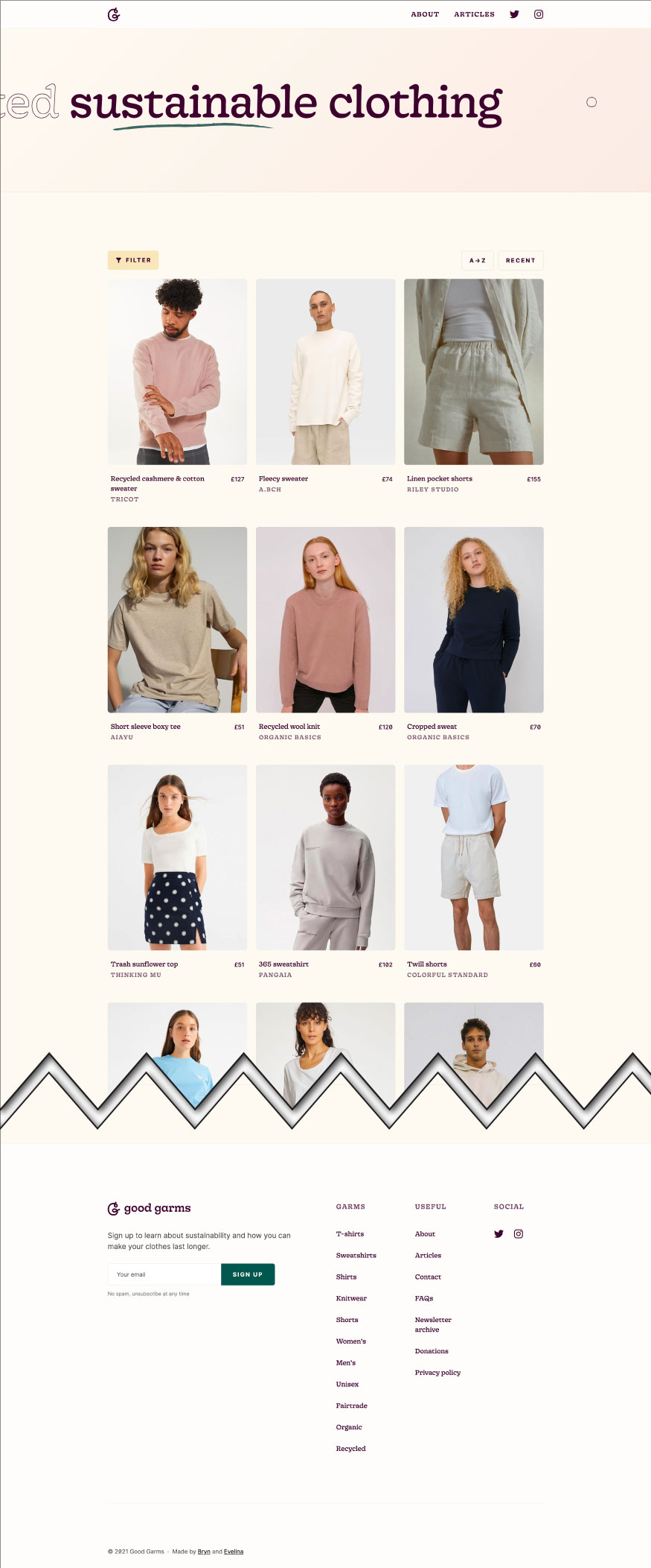
The fifth challenge in the UX/HTML/CSS Design and Code Challenge series is an e-commerce website. This challenge aims to combine several techniques that were applied in previous challenges including CSS Grid, Flexbox, and responsive design. Expanding on these features, this challenge aims to add implementation of accessibility standards. The inspiration for this challenge comes from the website Good Garms, an online shop to purchase clothing that prioritizes sustainability.
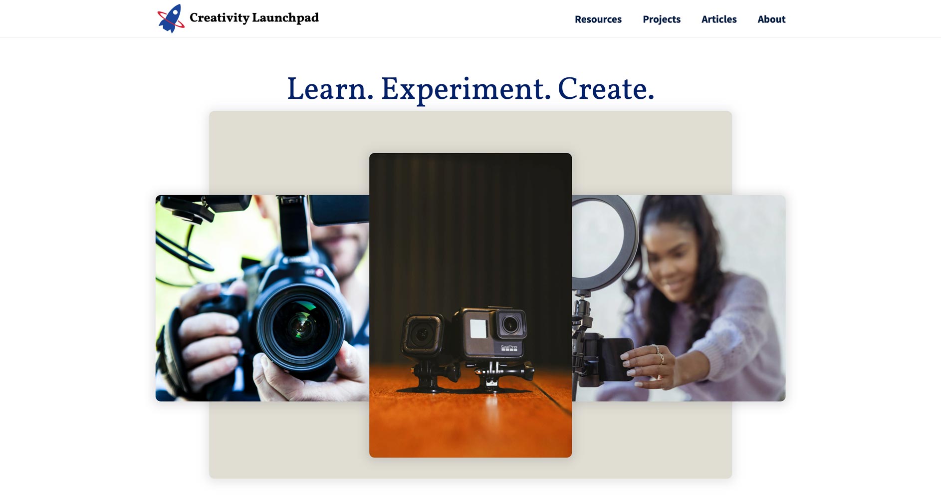
The challenge, similar to (previous challenges), is to recreate a design based on another website that serves as inspiration. The additional challenge this time is to also focus on the accessibility of the website while also creating an interesting and modern layout and design. The goal for this part of the challenge is to meet the accessibility standards as outlined in the WAI-ARIA Guidelines. The final website combines the layout and accessibility features to produce the website, Creativity Launchpad, which is a website for students to browse multimedia equipment, software, and learning resources.

Designing with Accessibility in Mind
For any web developer working in 2021, it’s essential to place accessibility high on the list of development priorities whenever starting a new project. Sometimes this means being mindful of best practices for using HTML sectioning elements. It also means making wise use of WAI-ARIA Guidelines and implementing techniques like “skip to content” links to maximize the accessibility of any website.
The steps to taken to implement accessibility feature in this challenge are aligned with the goals for the WCAG (Web Content Accessibility Guidelines) 2.0 Guidelines, with particularly emphasis on WCAG guiding principles of making websites 1) Perceivable, 2) Operable, 3) Understandable, and 4) Robust.
Ultimately, the goal for this and all accessible websites is to make them as usable for those with disabilities as they are for those without. This is challenging and requires a lot of reflection and planning.
A Fresh and Modern Design
The Inspiration Website - Good Garms presented many opportunities to implement an modern design with some really interesting layout and content features. The website is an e-commerce website that is focused on selling clothing that is sustainable and purposely aims to be different. The goal is to create a fashion brand that is open about its production, business values, and goals to provide excellent products with minimal impact on the environment.

As for design considerations, the inspirational website offers many interesting challenges. First, the layout of the home page appeared to be perfect for using CSS Grid, especially for the image cards of the different clothing products. A unique take on this is that the website that I’m designing based on the inspirational website will also use cards, but an indeterminate number of them. This is because the concept for a website that has many cards is that they would be dynamically loaded from external data. Because of this, a good approach is to use a system that auto-places cards without using a pre-defined HTML structure since the cards will not be hard coded. Additionally, the layout system should accommodate both desktop and mobile device layouts.
The header section, by contrast, could be laid out in a straight-forward manner by using Flexbox. This is because the layout is in one direction instead of being multidirectional and more “grid-like.” The footer could be laid out in either with Flexbox or CSS Grid. The reason to use CSS Grid is because there are multiple columns that have different widths.
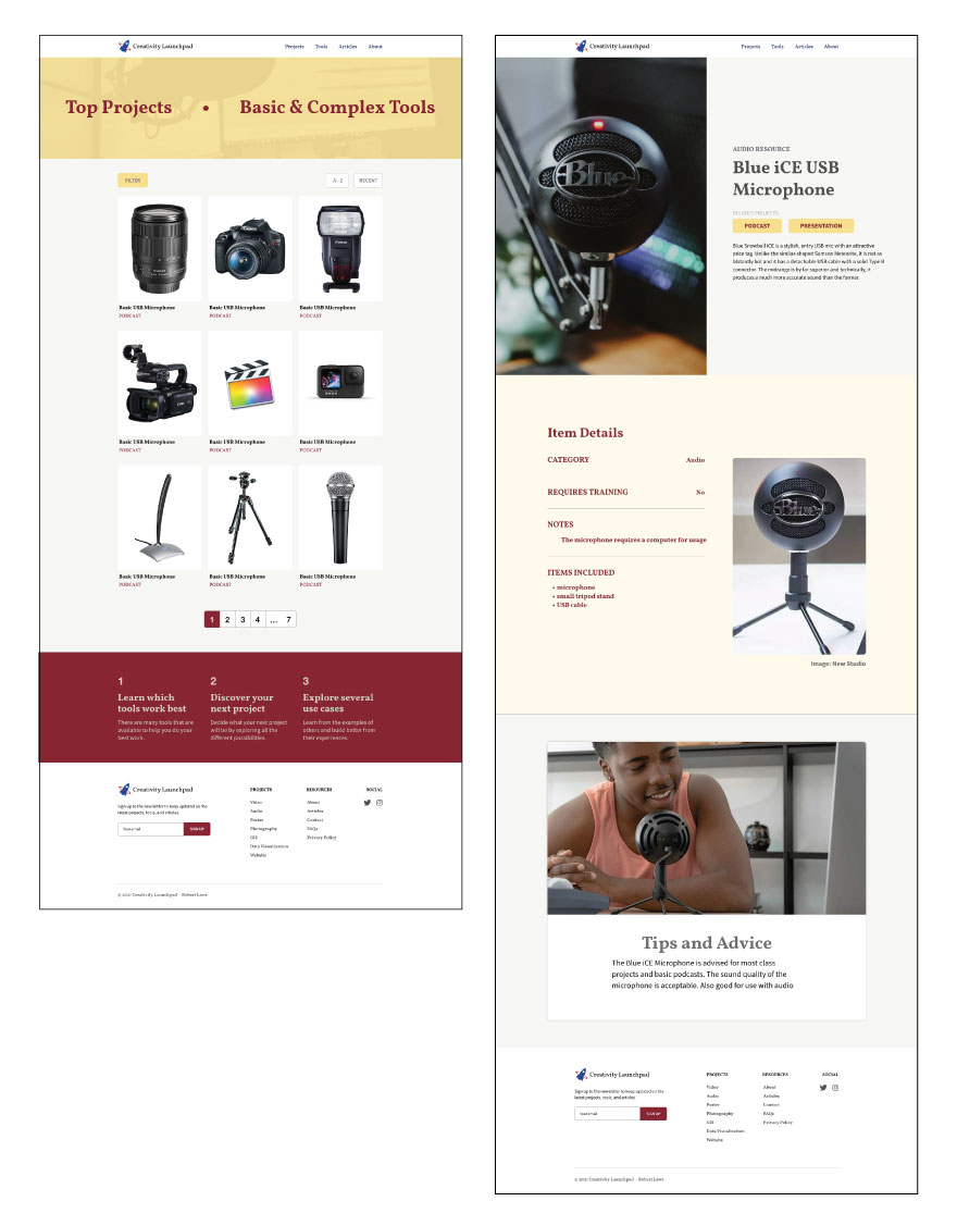
The website that will be created based on the inspiration website is called the Creativity Launchpad. It’s a website that offers “products” like multimedia equipment, software, and learning tools for students to be creative. The idea is that students would browse through the resources like they might on an e-commerce website, and select one they would want to use for multimedia-based class assignments. Each resource also has a “product page” that highlights the features of the resource and has more images of the resource.
Design with Grids
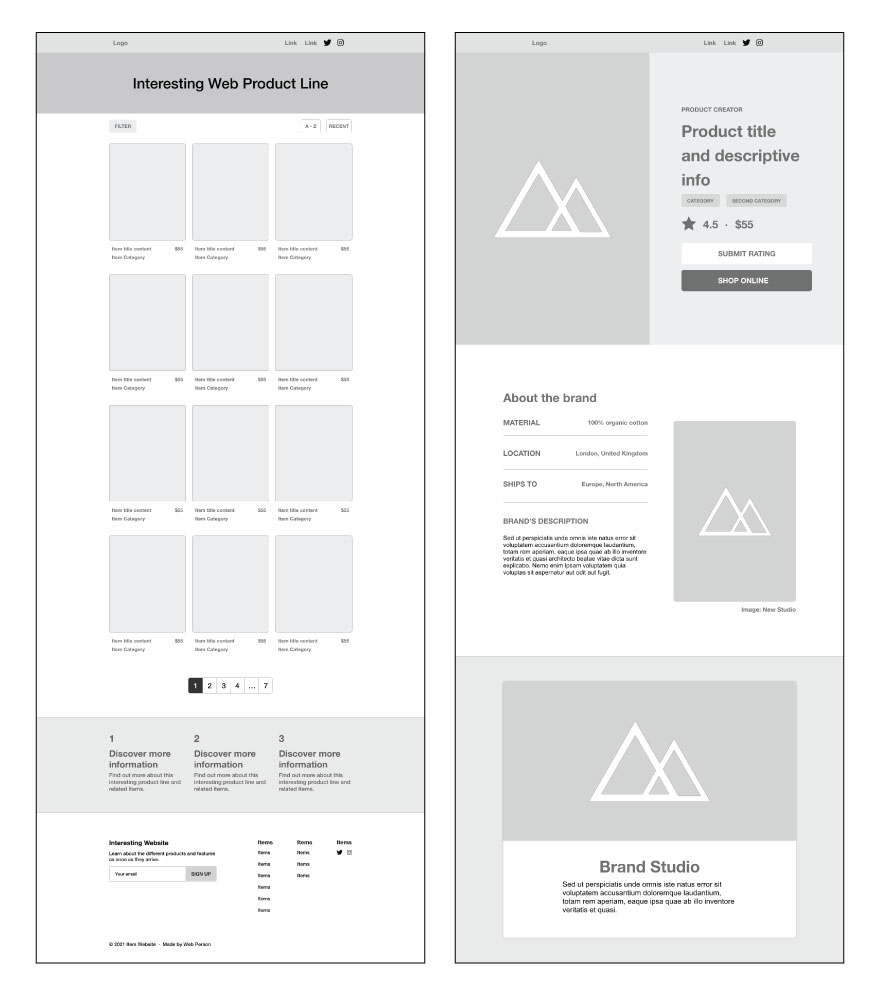
The design offered multiple layout challenges. Thankfully, CSS Grid is versatile enough to be able to produce many different styles of layout. For example, the wireframes below show two types of grids. First, there’s the grid on the left for laying out the different resources for the website. The grid is a three column design with an indeterminate number of rows. Next, the grid on the right side makes use of full-bleed images with text content that split the screen in half. Beneath this area is a full-width section with the content of “table-like” textual content next to an image that are together centered in the layout.

The design progressed from wireframes to prototypes to experiment with real-world content in the layout sketched out in the wireframes. This also included adding some additional stylistic elements including a logo, color scheme, typography, and sample content. The design progressed and showed some promise to mimic the modern look and feel of the inspirational website.

Design into Development
A key focus of the developmental phase was to use CSS Grid to build a layout that could conform to a desktop or mobile layout without the need for excessive media queries. With CSS Grid this is possible using some of the advanced features like auto-fill and minmax() to tell the grid to fit as many columns into the design based on a width that was between a defined minimum and maximum range.
As with other designs, it’s good practice to begin with the mobile layout first and then move onto desktop. However, for the grid of resources, I preferred to test out the concept first in a desktop layout to prove that the concept would work.
CSS Grid that Reshapes Itself
The grid would be composed of three columns for the desktop layout and one column on mobile layouts. To achieve this, the image cards would have to fit into three columns in a space with a max-width of 1200px. I also needed the cards to be no bigger than 300px wide to fit properly in a mobile device layout. The best way to approach this was to use the grid-template-columns property that repeated columns to full the available space (which is 1200px in this case) with columns no smaller than 300px and up to 1fr units. This produced a grid of 3 columns using the identically sized images for desktop and 1 column of images reduced to a minimum of 300px in the mobile layout.
.cards {
  display: grid;
  grid-template-columns: repeat(auto-fill, minmax(300px, 1fr));
  grid-auto-rows: auto;
  row-gap: 1rem;
  column-gap: 3rem;
}
The grid layout was also used for the resource page, which featured a single resource in more details. The grid layout for this was designed to span the entire width of the page. The original grid for the page was a four column grid that had two narrow sides with two large middle columns to divide the screen. This grid was applied to all immediate children elements of the site-container which wrapped all page content.
.site-container > * {
  display: grid;
  grid-template-columns: minmax(6rem, 1fr) repeat(2, minmax(auto, 600px)) minmax(6rem, 1fr);
  grid-template-rows: min-content;
}
The child element would apply the four column grid to its children and be available for visual styling. The four column grid would allow for elements to be centered in the grid or extend from one side to the middle or the entire width of the layout. For example, on the resource detail page, the screen is divided in half by a full-bleed image that takes up one half the layout and text content that takes up the other half.
.resource-image {
  grid-column: 1 / 3;
  grid-row: 1 / 2;
}

.resource-content {
  grid-column: 3 / 5;
  grid-row: 1 / 2;
}
The grid layout shown above places the resource-image in the first and second columns of the grid using the grid-column: 1 / 3; property and value. The resource text content is in the third and forth columns using the grid-column: 3 / 5; property and value. Both the image and text content are in the same row, which keeps them together for the desktop layout.
Things change, however, for the mobile layout. A real advantate of using CSS Grid is the ability to specify exactly where an element should be placed within the grid, which offers a lot of control over layout. In the case of the resource image and text content, The image spans the entire width of the mobile layout whereas the text content is placed in the middle of the layout. The image also appears above the text content, which is achieved by designating different rows for each element.
.resource-image {
  grid-column: 1 / 5;
  grid-row: 1 / 2;
}

.resource-content {
  grid-column: 2 / 4;
  grid-row: 2 / 3;
}
Accessibility is Paramount
The design and development process went well, but could not be considered complete without going through an accessibility checklist to verify compliance. Thankfully, there are several great resources in addition to the WCAG website. First, WebAIM - Web Accessibility in Mind offers a great checklist and tool to check the accessibility of a website. Next, The A11Y Project provides great information and a checklist for accessibility. Finally, MDN Web Docs has a great section all about accessibility. Each of these resources is great to help verify compliance with WCAG standards. Some examples of application of accessibility standards for the challenge website included:
For this challenge, several accessibility features were added and verified for compliance. Some of these include:
-
A link to skip to the main content on the page that allows keyboard-only users to bypass navigation information and focus on the main content.
-
Tab-order was checked for logical progression through the web page and a visual indicator was confirmed for each item in focus.
-
The semantic structure of the website was logical and made appropriate use of headings to indicate the hierarchy of the content.
-
The colors used provided sufficient contrast for easy legibility.
-
Images used on the page had alt tags that were descriptive of the image.
-
Elements used only for decorative purposes were given a
role="presentation"attribute to remove them from screen readers. -
Each page had a descriptive title for the page content.
-
Inline SVG images had
titleanddescriptionelements embedded within the svg element to provide information for screen readers.
This is just a sample of the accessibility features that were added to the challenge website. Another great tool for verifying accessibility compliance is the Lighthouse Chrome extension, which offers a score on the page and a report of the web page accessibility compliance. For the challenge website, the accessibility score was 100, which shows maximum compliance based on the criteria of the extension.
Conclusion
This challenge was really great to test out bold layouts and apply CSS Grid and Flexbox in some interesting combinations and with advanced techniques. The final website is stylish and responsive. The focus for this challenge on accessibility was also useful to learn more about the standards and how to make the best use of them. Having tools to test and provide feedback on compliance is helpful so as not to miss out on anything that could make the website less usable for all types of users.
