Challenge One - Blogging Website
The first challenge in the UX/HTML/CSS Design and Code Challenge series is a blogging website. Although the design and layout of blogging websites can be simple, they can offer many interesting challenges for design and code. The inspiration for this challenge comes from the website We The Parents, which is a blog intended for parents.
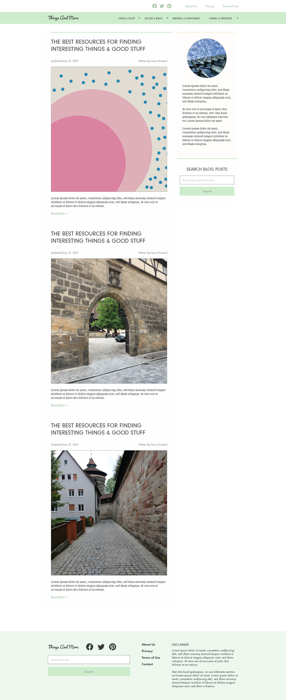
The challenge is to recreate the design of the website homepage. The process begins by breaking down the design with the tool Adobe XD. After that, it’s on to VSCode to begin putting together the HTML layout before finally adding the CSS styling.
Website Structure
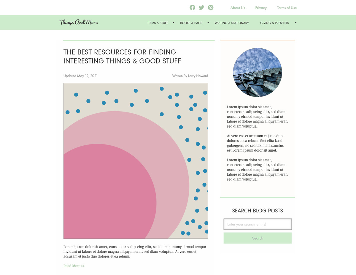
The first part of the challenge is to analyze, break down, and replicate the structure of the inspiration website into my own layout and design. The homepage of the website has many common features found on a blogging website including:
- header with different types of navigational links
- content are with a list of blog teasers
- sidebar with narrative and search features
- footer with copyright and additional navigation.
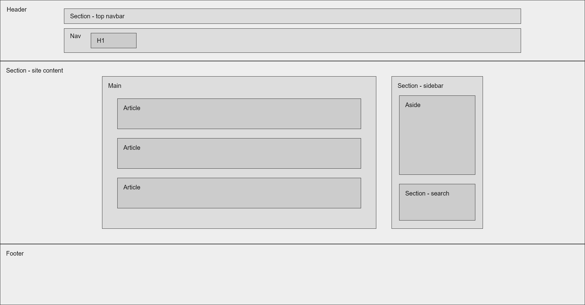
The first hurdle of the challenge was deciding how to divide the webpage into semantic elements. The website is divided vertically into three sections, a header, a section with content, and a footer. Within the header are two types of navigation - first a top by with secondary navigational links and a nav with the branding and main navigation. Within the section with content there is a main element, which contains the focal point of the webpage - the individual blog entries. Additionally, within the section with content is a sidebar that consists of an aside with related information to the main content and a section with a site search feature. Finally, the footer contain additional site navigation and content.
Design
With the design, I adopted an Atomic Design approach to the various elements and their combinations within the overall layout and design. The Atomic Design approach is based on the atomic design theory develop by Brad Frost and described in detail in his book Atomic Design. The basic idea behind atomic design is that components within a design can be built from the ground from the smallest pieces - or atoms - and grow in complexity as they’re combined to form molecules and organisms. Once a design has built a list of atoms, molecules and organisms they can be arranged within a templates, and finally populated with content to produce pages.
Since this challenge is fairly easy, the components of the website are relatively uncomplicated from an atomic design perspective. The majority of the content of the site consists of atoms and molecules.
Atoms and Molecules making up the Sidebar Section of the Template
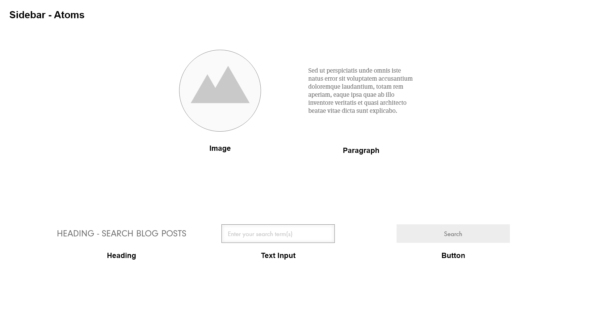
This image shows the atoms used within the sidebar section of the template. An important feature of atoms is that they cannot be broken down further without losing their meaning and usefulness in a design.
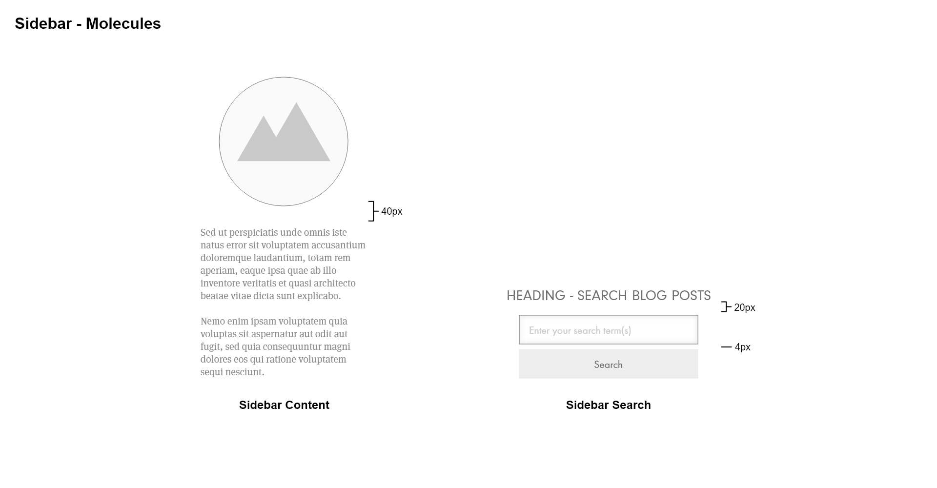
This image moves forward and combines the atoms together to form two molecules. What stands out to me about what makes a molecule a distinctive unit and not just two atoms grouped together is the relationship and dependency between the combination of atoms. For example, in the molecule entitled Sidebar Content in the image above, the image and paragraph must depend upon each other in some way for this to be considered a molecule. In other words, the image must depend on the paragraph to give essential contextual meaning to the image and the paragraph must depend on the image in order for the text to be meaningful. If the image and paragraph are unrelated to each other, then this does not seem to me to make a molecule since either the image or paragraph could be removed and there would be no change in the meaning of the image or paragraph on its own.
The same applies to the Sidebar Search molecule. The heading, text input, and button all depend on each other to be meaningful. The heading provides important contextual information about what is being searched when someone enters words into the text input and can submit the search using the button. The text input depends on the heading to provide context to how a user will enter text into the input and submitting their search query only after clicking the search button. The button depends on the heading and the text input to make sense of the expected outcome of clicking the button.
The Sidebar Search becomes a molecule based on the dependency between the atoms. The content information of each atoms matters in this case since different content could be used in different combinations to the same effect. For example, if the button text said “Search Blog Posts” then it could be argued that the text input and button don’t necessarily depend on the heading to be meaningful and the heading therefore could be removed. The text input and button would still exist as a molecule.
Final Design Template
For this challenge, applying atomic design was useful, but it is also a work in progress. Since this is the first challenge, part of the process is figuring out a good workflow and the best way to produce a final result. The design produced in the end is correct from a visual point of view - it visually matches the original website used for inspiration. The underlying process of building a design from the ground up, however, will need refinement. Applying an atomic design approach may work best by breaking a design down into its constituent atoms and then rebuilding it into molecules and organisms. Parallel with this process is the creation of a template in which atoms, molecules, and organisms are placed. The process could stop here, but to give the challenge more realism, actual content could be used to produce pages that are meaningful as well as visual consistent with the original inspirational website.
Code
HTML
In theory, the work done in the design phase developing a template and building components should make the coding phase much easier and quicker. The template lends itself to the creation of a rough semantic structure for the webpage. Based on the template, the HTML for the page takes the following shape.
<body>
  <header>
    <section>
      <nav>
        <h1>Site Title</h1>
      </nav>
    </div>
  </header>
  <section>
    <main>
      <article>Blog Post</article>
      <article>Blog Post</article>
      <article>Blog Post</article>
    </main>
    <section>
      <aside>
        Related Content
      </aside>
    </section>
  </section>
  <footer>
    Footer Content
  </footer>
</body>
This HTML formed the foundation for the webpage, although it evolved somewhat differently as the page was constructed. Looking back on the process, an interesting approach to take would be to identify distinctive atoms, molecules, and organisms and spend time developing each in isolation first then integrate them into the template. For content that takes the shape of molecules, this seems natural. For example, the sidebar search can be developed on its own and then brought into the designated spot within the template layout.
The sidebar search has a simple HTML structure, as shown below. The three atoms - h4, input, and button - are held together as a molecule by the section element. An interesting consideration is thinking about the responsibility of the section element. In this case, the section is responsible for grouping together the atoms and the CSS applied cascading from the section element is responsible for styling of the atoms within the full width and height of section element. However, the section element does not determine what the final width will be, the layout template is responsible for that.
<section class="site-content-sidebar-search">
  <h4>Search Blog Posts</h4>
  <input type="text" placeholder="Enter your search term(s)" />
  <button>Search</button>
</section>
CSS
A big part of this challenge was implementing the layout of the design. The solution relied heavily on Flexbox. For this challenge, no responsive options are provided for non-desktop layouts. A few features employed for this challenge were CSS variables for the colors, which made them easier to translate from the design to the CSS. Also, web fonts for the typography, more on that later.
The CSS code sample below shows how the styling was organized and made use of the CSS variables. A key part of the CSS was to make atomic elements like the input and button take up the entire width of their container. This meant that the container was responsible for how wide the element appeared on the screen, not the element itself.
.site-content-sidebar-search {
  display: flex;
  flex-direction: column;
  align-items: center;
  width: 100%;
  padding: 1rem 1.25rem 0;
  background-color: var(--light-green);
  border-top: 6px solid var(--mid-green);
}

.site-content-sidebar-search h4 {
  font-size: 1.2rem;
  text-transform: uppercase;
  margin-bottom: 1rem;
  font-family: Lato, Arial, Helvetica, sans-serif;
}

.site-content-sidebar-search input,
.site-content-sidebar-search button {
  font-size: 1.25rem;
  font-family: Lato, Arial, Helvetica, sans-serif;
}

.site-content-sidebar-search input {
  width: 100%;
  padding: 0.8rem;
  border: 1px solid var(--lighter-gray);
  box-shadow: inset 0 0 1px var(--gray-text);
  font-size: 0.9rem;
  margin-bottom: 0.25rem;
}

.site-content-sidebar-search input:focus {
  outline: none;
  border: 1px solid var(--darkest-green);
}

::placeholder {
  color: var(--light-gray);
  opacity: 1;
}

.site-content-sidebar-search button {
  width: 100%;
  border: none;
  padding: 1rem;
  background-color: var(--dark-green);
  color: var(--light-gray-text);
  font-size: 0.9rem;
  cursor: pointer;
}

.site-content-sidebar-search button:hover {
  background-color: var(--darkest-green);
  color: var(--white);
}
Learning Concept - Web Fonts
As part of enhancing the value of the challenge, there is an additional learning concept component to the challenge. For this challenge, the learning concept applied was web fonts. Browsers apply the font choices defined in the webpage, typically from the CSS file. The browser is dependent, however, upon the installed fonts on a user’s computer. So for example, if the website makes use of an exotic cursive font like Pacifico, for example, the CSS rule for the font could be written as the following:
h1 {
  font-family: 'Pacifico Regular', cursive;
  font-size: 4rem;
}
In the case above, if the font ‘Pacifico Regular’ is not installed on a user’s computer the browser will fall back to the next entry in the font stack, cursive in this case. This may not match the intended design that the developer wants the user to experience. A solution to this problem is web fonts.
Web fonts come in two main options:
- Loading the font from an external font file (often a .woff or .woff2 file) from a website like Font Squirrel, or
- Loading the font from an online font service like Google Fonts
The next step is to reference the font through either an @font-face rule or by using a <link> element loading the online font within the HTML head section.
@font-face {
  font-family: 'Pacifico Regular';
  src: url('fonts/pacifico.woff2') format('woff2'), url('fonts/pacifico.woff')
      format('woff');
  font-weight: normal;
  font-style: normal;
}
The font file is referenced above. Both woff2 and woff are listed to maximize browser compatibility. The first font file listed that a browser can use will be the file selected.
For fonts from a font service, the provider website usually has information on how to use its fonts. In the case of Google Fonts, an option to link to the file is provided.
<link rel="preconnect" href="https://fonts.gstatic.com" />
<link
  href="https://fonts.googleapis.com/css2?family=Lato:ital,wght@0,400;0,700;1,400&display=swap"
  rel="stylesheet"
/>
Once both types of web fonts have been properly loaded, using them in CSS is straight forward. In this challenge, two web fonts were used. Pacifico for the website title and branding, and Lato for navigational and heading elements.
a.branding-navbar-link {
  text-decoration: none;
  font-family: 'Pacifico Regular', cursive;
  font-size: 1.8rem;
}

a.main-navbar-link {
  margin: 0 1.5rem;
  text-decoration: none;
  font-family: Lato, Arial, Helvetica, sans-serif;
  text-transform: uppercase;
}
Conclusion
This challenge was a good start to the UX/HTML/CSS Design and Code Challenge series. The website wasn’t too complicated, but challenging enough to present some new and interesting learning opportunities. Making use of the atomic design approach in future challenges will show how well it is to employ in the design and coding parts of future challenges. Refining how it can be used will be a key goal for future challenges. Another area for future improvement is become more adept at using Flexbox to control layout. Finally, working on organization and naming conventions for CSS will be a key area for improvement.
What I find is that making good designs and writing good code is important, but its also important not to dwell on it too much when its not perfect. A good idea is to make a good attempt, identify what went well and what can be improved, and move on with that knowledge to the next challenge.
