CSS Layout Basics
As CSS has evolved, new and powerful features have been added for control over layouts, including Flexbox and CSS Grid Layouts. However, older layout techniques like positioning, floats, and multi-column layout are still very useful and should definitely be part of the CSS developer’s arsenal. Flexbox and CSS Grid Layouts are great for handling site-wide layout, but aren’t always the best for handling intricate layout needs. Here, I’m thinking of things like a badge with an alert positioned in the corner. It’s also important to have a grasp on some of the fundamentals of document flow, which can trip up developers who aren’t aware of default behaviors or how different positioning properties work in conjunction and/or relation with each other.

Normal Flow
Browser control of layout is also known as Normal Flow and determines how elements display within the webpage and relate to the layout and positioning of other elements. Understanding normal flow is useful for understanding why the different layouts for elements on a website and what properties can be modified to make changes to normal flow.
An important aspect of the normal flow is whether or not elements flow next to other elements - remaining on the same line - known as inline display. Or if they will take up an entire line only to themselves - known as block elements.
For example, elements such as the <div>, <p> and <li> are block elements and will take up an entire line to themselves and push subsequent elements to a new line in the flow of the page.
By contrast, elements such as <strong>, <em>, and <span> are inline elements and will flow next to each other in the same line on the page.
Positioning
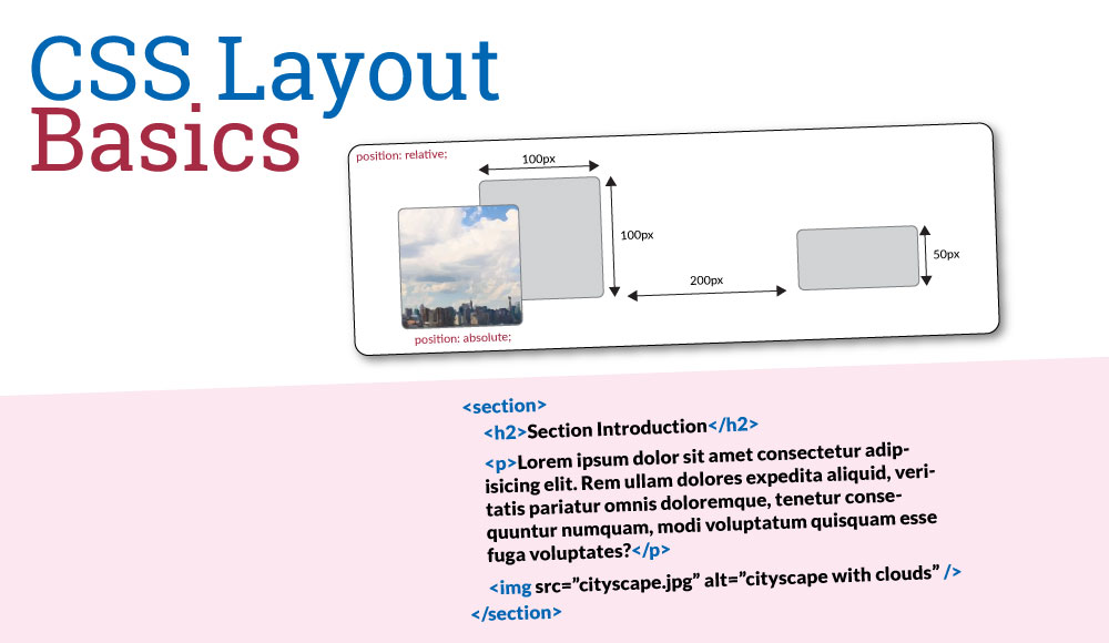
Without intervention elements will follow normal flow, but it’s possible to take elements out of the normal flow by making use of the position property. This property makes it possible to override the default behavior for element flow. The values available for the position property are static, relative, absolute, fixed, or sticky.
Static
The default behavior for the position property is static. This will arrange elements in their normal position within the document flow.
Relative
By assigning the position property a value of relative, the element will be available for repositioning based on use of the top, bottom, left, or right properties. The values provided to the element’s position will move it with reference to it’s position within the normal flow. Additionally, the element will move in the opposite direction of the positioning value specified. For example, is a value of 100px is given for the bottom position, the element will move 100px up from the bottom.
Absolute
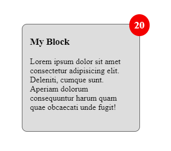
By assigning the position property a value of absolute, the element will be taken out of the normal flow and positioned based on the values of the top, bottom, left, or right properties. The element is also positioned absolutely with reference to its containing element, but only if the position of containing element (or another ancestor) is explicitly defined as a position other than static. This is an important point since elements will be positioned absolutely with reference to the root page element unless a containing element specifies a non-static position. Take the code below as an example. The <span class='views'> element should be positioned in the top right corner of the <div> element. This is accomplished by specifying a position of relative for the div and a position of absolute (with a top and right property) for the span.
<div class="my-block">
  <h3>My Block</h3>
  <p>
    Lorem ipsum dolor sit amet consectetur adipisicing elit. Deleniti, cumque
    sunt. Aperiam dolorum consequuntur harum quam quae obcaecati unde fugit!
  </p>
  <span class="block-views">20</span>
</div>
.my-block {
  height: 200px;
  width: 200px;
  background-color: #ddd;
  border: 1px solid #555;
  padding: 5px 15px;
  border-radius: 10px;
  position: relative;
}

.views {
  padding: 10px;
  background-color: red;
  font-weight: bold;
  font-size: 20px;
  color: white;
  border-radius: 100%;
  position: absolute;
  top: -20px;
  right: -20px;
}
The result appears as the following:

Fixed
A position defined as fixed will behave exactly like an absolutely positioned element, except that the element will remain fixed in place relative to it’s nearest positioned ancestor or the initial containing block if no ancestor is positioned.
Sticky
A position defined as sticky acts as a hybrid of a relative and fixed positioned element. An element with the position sticky will move with the flow of elements until it reaches a threshold position defined by top, bottom, left, or right. At this point the element will behave like a fixed positioned element.
Z-Index
When positioning elements with most of the positioning options there will be situations when elements overlap and are placed under or on top of each other. To control the stacking order of elements, the z-index property is available. By default, elements have a z-index of 0 and can be made to appear higher in the stacking order by giving a value of greater than 0. Elements with a z-index higher than other elements will appear “on top” of them when overlapping.
Floats
For situations where an element should have text content flow around it, floats can be useful. One issue with floats is controlling how content flows around it properly, especially if floats are applied to a container element like a <div>. This is done either through a “clearfix” hack or by using the display: flow-root css rule.
Clearfix
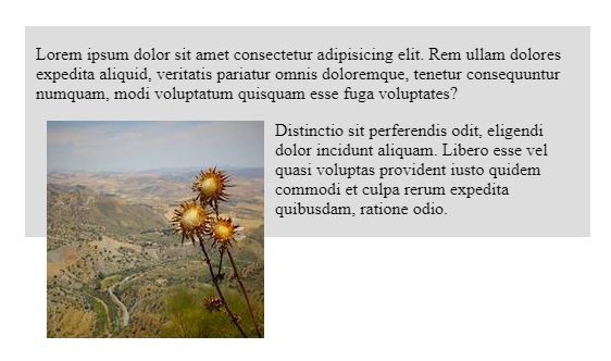
Traditionally, the problem with using floats is that there was always the problem of a floated element overflowing it’s container, resulting in an unsatisfying display, as shown below.
<section class="my-section">
  <p>
    Lorem ipsum dolor sit amet consectetur adipisicing elit. Rem ullam dolores
    expedita aliquid, veritatis pariatur omnis doloremque, tenetur consequuntur
    numquam, modi voluptatum quisquam esse fuga voluptates?
  </p>
  <img src="https://picsum.photos/200" alt="random image" />
  <p>
    Distinctio sit perferendis odit, eligendi dolor incidunt aliquam. Libero
    esse vel quasi voluptas provident iusto quidem commodi et culpa rerum
    expedita quibusdam, ratione odio.
  </p>
</section>
.my-section {
  background-color: #ddd;
  padding: 1px 10px;
  width: 500px;
}

.my-section img {
  float: left;
  margin: 0 10px 10px;
}

To correct this problem, a hack was introduced called the clearfix hack to force the container element to expand itself beyond the floated content. The CSS below accomplished this task.
.clearfix::after {
  content: '';
  clear: both;
  display: table;
}
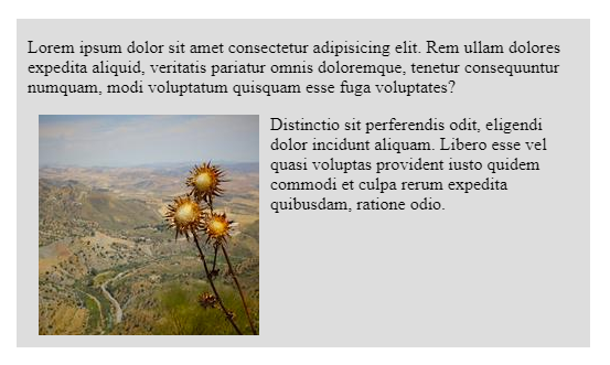
Once applied, the resulting display is improved.

A more modern ways of handling this problem is by using the display: flow-root; property, which will have the same result as the clearfix hack.
Multi-Column
The multi-column layout property provides the ability to split content into columns either by a column count or width. The browser will calculate how each column should be divided and how much space it will occupy in the case of column-count or how many column it will create in the case of column-width.
.container-1 {
  column-count: 3;
}

.container-2 {
  column-width: 300px;
}
Columns can also be styled with the column-gap to add spacing between columns and column-rule to place a vertical rule between the columns.
.container-2 {
  column-gap: 2rem;
  column-rule: 1px solid #ddd;
}
An element can be made to span the columns of a layout by adding the column-span property. The value should be set to all for the element to span all the columns of the layout.
.container-1 h3 {
  column-span: all;
}
There are instances when a column layout will fragment content of an element between one column to the next. This can sometimes result in an undesired appearance, especially if there’s visual styling applied to an element. To avoid this, the properties break-inside and page-break-inside can be used to tell the browser to prevent this behavior.
.container-3 p {
  break-inside: avoid;
  page-break-inside: avoid;
}
