Tableau Dashboards
There are many options for creating compelling data visualizations and performing complex data analysis and reporting. Tableau is in many ways the most accessible of the many tools available. Tableau is different than other tools like Microsoft Power BI and Google Data Studio in that it is not integrated into a suite of other tools that come with Microsoft and Google. This is both a benefit and a limitation, but perhaps only for some particular use-cases.

Tableau can be used to create individual data visualizations, data dashboard made up of several individual data visualizations, and stories that walk a viewer through a collection of data dashboards and/or individual data visualizations. Effective presentations can be created using each of the different types of visualizations or combinations in Tableau. For data analytics, however, the data dashboard provides the most power.
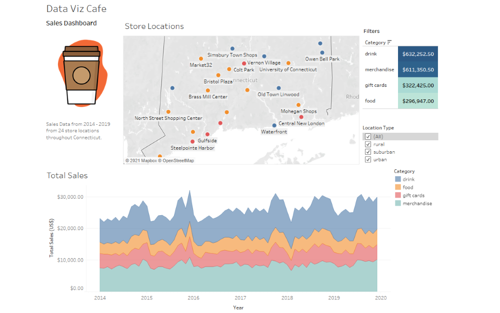
The data dashboard allows the creation of complex interactivity. A developer can “hand-over” the controls to a viewer using dashboards. What this means is that filters can be set-up by the Tableau developer and a viewer will be able to apply the filters on the dashboard, reshaping the data visualizations. A powerful feature is the ability to apply more than one filter at a time on a dashboard. The result is a multi-dimensional filtering system that allows a view to slice and dice the data visualizations based on the level of detail they wish to view.
Tableau Help Guides
A key plus to using Tableau is the large amount of support documents they provide to help use their products. A good example of this is the their Create Dashboards section. This includes a series of different web pages detailing things like Best Practices and Accessibility. A new or experienced user can benefit from the content in each section of the many help guides.
A key principle stressed in the Best Practices help section is to keep the dashboard simple. This means reducing clutter and the complexity of the various text and filters placed on the dashboard. Placing too many visualization within a dashboard runs the risk of squeezing each visualization into smaller and smaller spaces where the detail of the visualization is tool small to understand. This advice goes along with keeping the dashboard focused on a core purpose and avoid including unrelated visualizations.
Even though there is a steep learning curve to build a high level of comfort with the software, once achieved developing impactful dashboards can be done quickly and as creative as the develop wants them to be. The visual customizations available from Tableau give developers a wide range of possibilities for how they want to adjust the look and feel of their visualizations and dashboards.
