Using Fonts on the Web
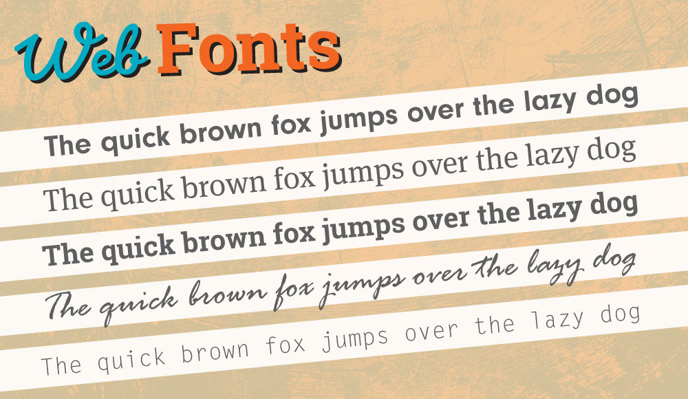
Typography and Fonts used on the web has evolved greatly since the early years of the Internet. For many years, web developers were limited to a handful of reliably available system fonts installed on most user’s computers. Today, however, there are many more options available. Depending on the needs of the users of a website, there are different solutions from the basic and built-in fonts that come with most computers to elaborate and decorative fonts that are available for free and as a paid resource.
Using fonts on the web can be done through different methods, the most prominent methods are described below. The ability to manipulate and serve users customized and interesting fonts helps make a unique and pleasing experience for visitors of a website.

The Basics
From the web’s inception typography has been at its core. With the use of CSS, it’s possible to modify and customize how text is presented within webpages. The most basic way this is done is through the different styling properties that can be applied to text elements on a webpage.
The way that fonts and styling are applied to text falls into two main categories. First, there’s Font Styles, which determines things like sizing, font-family, if the text is bold or italic. The second category deals with Text Layout, which are properties that affect line spacing and alignment with the content box.
The properties that are most commonly applied to text to affect its styling including color, font-family, font-size, font-style, font-weight, text-transform, and text-decoration.
Other important properties are text-shadow, text-align, line-height, letter-spacing, and word-spacing.
This is not the end of the list - there are many more CSS properties that can affect text in an HTML document.
To make use of these different properties, values can be defined for each and applied to an element on a webpage. For example, a paragraph element as shown below.
p {
  color: gray;
  font-family: Helvetica, Arial, sans-serif;
  font-size: 1.5rem;
  font-weight: normal;
  text-decoration: underline dashed green;
  text-transform: uppercase;
}
Some font style properties have a shorthand version that can be used to combine some of the individual property declarations. For example, the properties for text-decoration-line, text-decoration-style, and text-decoration-color can be combined using the text-decoration property, as shown below.
/* text-decoration is shorthand for the following: */
text-decoration-line: underline;
text-decoration-style: dashed;
text-decoration-color: green;

text-decoration: underline dashed green;
Another good example of the use of a shorthand version is with the font property itself. The properties for the font property are applied in order: font-style, font-variant, font-weight, font-stretch, font-size, line-height, and font-family as shown in the example below.
font: italic normal bold normal 3em/1.5 Helvetica, Arial, sans-serif;
Also note that the font-size and line-height properties must include a ‘/’ between them to be applied. If something else, like a space is used, the entire line is ignored.
Web Safe Fonts
Since application of a font defined in a stylesheet is dependent upon the user’s system having that font installed, developers need to anticipate cases when they are not. To address this, it’s generally safe to make use of a set of fonts that are generally installed on all computer systems. They include:
- Sans Serif Fonts - Arial, Helvetica, sans-serif
- Serif Fonts - “Times New Roman”, Times, Georgia, serif
- Monospace Fonts - “Courier New”, Courier, monospace
To apply the web safe fonts to an element on a web page, the following CSS is used:
p,
ol,
ul {
  font-family: 'Times New Roman', Times, Georgia, serif;
}
The fonts listed together "Times New Roman", Times, Georgia, serif are called a font stack. A font stack will apply the first available font listed in the stack from left to right. If a font is not available, the browser will continue to the next listed font in the stack and apply it. If no fonts are available, the browser will apply a default style. Using the keywords sans-serif, serif, or monospace will tell the browser to use the default font for that category of fonts. Also note that fonts with multiple words are enclosed within quotations.
The problem with using the default, or web safe, font options is that developers have very little option for providing a customized, interesting, and unique user experience on their websites. Relying on only web safe fonts means that almost every website will have a similar typographical look and feel, which is not very fun for a developer and not very appealing for the user.
Web Fonts
To address the problem of the limited number of fonts available to users, the solution was to provide browsers with the capability to use fonts loaded from external files. Web fonts allow developers to select and use custom fonts without worrying if the font is or is not already installed on the user’s computer. For this reason, web fonts offer a good solution to add new and interesting fonts for an improved user experience.
There are two general ways to use web fonts. First, using a font file in a format like woff or woff2 that can be saved with the HTML and CSS files and referenced in the CSS code using the @font-face rule. A great resource like Font Squirrel is very good to obtain font files.
/* font definition */
@font-face {
  font-family: 'Crete Round Regular';
  src: url('fonts/creteround-regular.woff2') format('woff2'), url('fonts/creteround-regular.woff')
      format('woff');
  font-weight: normal;
  font-style: normal;
}

/* font referenced */
h1 {
  font-size: 4rem;
  font-family: 'Crete Round Italic';
}
The other way of using a web font is by referencing a font provided by an online service. An example of this type of font are the fonts available from providers like Google Fonts or Adobe Fonts.
After selecting a font from the online service, the font can then be added via a link tag and then referenced using a font-family property. The example below shows how to use Google Fonts and includes some extra code to ‘preconnect’ to the Google Fonts server in order to speed up the process of downloading and using the font in a browser.
/* font definition */
<link rel="preconnect" href="https://fonts.gstatic.com" />
<link href="https://fonts.googleapis.com/css2?family=Lato&display=swap" rel="stylesheet" />

/* font referenced */
font-family: 'Lato', sans-serif;
Although web fonts offer a significant step forward in terms of using custom fonts, they do have some issues that need to be considered. The biggest problem with web fonts is the size of the font files needed to offer a full range of styles and weights (for example, italic and regular styles and thin, normal, bold weights) requires loading of separate files for each or one big file for all variations together. This can put strain on the browser to take time downloading all the files before they can be used on the webpage. In situations like this, there are two potentially problematic situations for a user:
- Flash of invisible text (FOIT)
- Flash of Unstyled Text (FOUT)
These are situations where the browser is waiting to download and use an externally loaded web font, but before it is able to download and display the font the browser either shows blanks (or invisible text) where text content should appear (FOIT) or text that makes use of default styling then switches to the downloaded font, flickering the text for a moment in the process (FOUT). Some ways to deal with this situation is to define a font-display property in CSS for how the browser should handle loading an external font or to preload a font by defining a few properties in the <link> tag that loads the font into the browser as shown below.
<link rel="preload" href="fonts/creteround-regular.woff2" as="font" />
A great resource for dealing with some of the quirks of web fonts is a guide to Font Loading Strategies and the article Fighting FOIT and FOUT Together by CSS-Tricks.
Variable Fonts
A recently development in browser and CSS technology offers another solution and improvement for using custom fonts in webpages. Variable Fonts are designed to include many variations of a font’s weight, style, width, and more (each one called different axis of variation or variable axes) into a single file that can be accessed through different CSS properties. This solution reduces the number and size of font files that need to be downloaded for their use on a webpage and it offers developers a lot of options for how they can use a particular font.
To use a variable font, its first necessary to find them. There are several good resources for finding and experimenting with variable fonts. Once a variable font is downloaded, it can be referenced in CSS through the @font-face rule, as shown below.
@font-face {
  font-family: 'Commissioner';
  font-weight: 100 900;
  font-style: normal;
  font-stretch: normal;
  src: url('fonts/Commissioner.ttf') format('truetype');
  font-display: swap;
}
Once defined, the variable font can be used in the CSS. In the example below, the ‘Commissioner’ variable font is applied to an h3 element. By using the font-variation-settings property, it’s possible to make use of the different variation axes that are defined for the font. In this case, weight, slant, and a custom axes of volume are being used (custom axes must appear in uppercase - ‘VOLM’ in example below).
h3 {
  font-family: 'Commissioner';
  font-size: 2rem;
  font-variation-settings: 'wght' 600, 'slnt' -10, 'VOLM' 100;
}
There are two types of axes that can be used by variable fonts. The first five are registered axes, which are the most frequently used axes and standardized (weight, width, slant, italic, and optical size). The other possible type of axes are custom axes, which are defined by the font designer if desired. The custom axes is given a four-letter tag used to reference the property in CSS. Some examples of both are the following:
/* Weight */
.my_font {
  font-weight: 900;
  /* OR */
  font-variation-settings: 'wght' 900;
}

/* Width */
.my_font {
  font-stretch: 105%;
  /* OR */
  font-variation-settings: 'wdth' 105;
}

/* Optical Size */
.my_font {
  font-optical-sizing: auto || none;
  /* OR */
  font-variation-settings: 'opsz' 144;
}

/* Slant */
.my_font {
  font-style: oblique -5deg;
  /* OR */
  font-variation-settings: 'slnt' -5;
}

/* Italic */
.my_font {
  font-style: italic;
  /* OR */
  font-variation-settings: 'ital' 1;
  /* Prevent automatic browser behavior */
  font-synthesis: none;
}

/* Custom Variation Axes */
.my_font {
  font-family: 'Rhododendron';
  /* Custom options for the fonts ascenders and descender */
  font-variation-settings: 'ASCN' 225, 'DESC' 150;
}
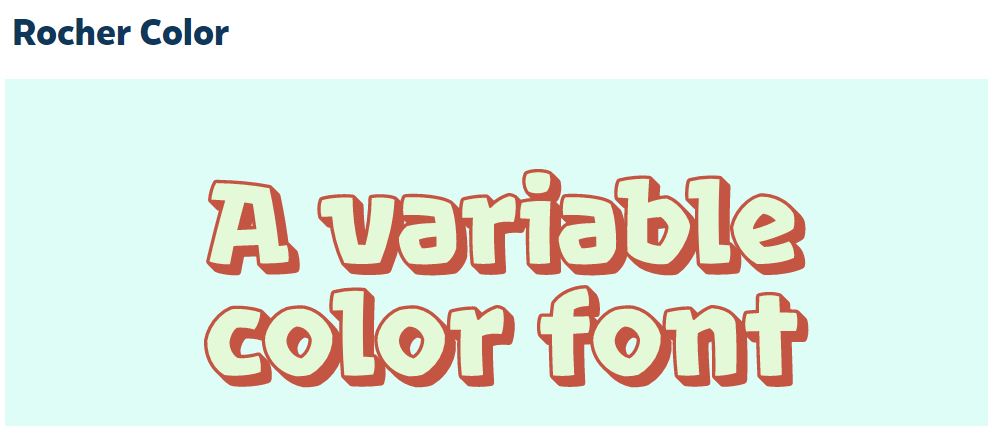
Another key feature that variable fonts allow is the creation of new and creative fonts with properties not typically available to traditional fonts. An interesting example of this is the font Rocher Color from Harbor Type. This font has a custom Bevel and Shadow axes that makes it unique.

.my_font {
  font-family: 'Rocher Color';
  font-size: 4rem;
  /* Use Uppercase Letters for custom axes */
  /* [FLAR,VOLM,slnt,wght] */
  font-variation-settings: 'BVEL' 50, 'SHDW' 80;
}
Depending on developer’s needs and the type of user experience expected, there are many different and good options available for typographical presentation on the web.
