Introduction
Students at my organization occasionally have assignments or projects that require working with media production tools and software. To work on these types of assignments, students come to the library to make use of the different hardware, software, and learning resources available to them. The process of discovering and choosing from the many resources available can be overwhelming at first. This is where the library can jump in and provide a tool that will help students discover recommended resources based on their specific project requirements. The library can also help them explore the full range of resources available to them and learn about different types of media, creation workflows, and where to look to learn more about media production processes.
The Challenge
Students have a long list of tools, software, and learning resources available to choose from when working on their assignments. Simply providing a long list to scroll through is not good enough. The challenge of this project is to build a website that presents the full range of data available in a way that is intuitive to explore and digest. Students may also have different preferences for exploring the data. For example some students may prefer using filtering utilities to explore lists of resources and other students may prefer reading detailed information on a particularly resource or topic. An additional challenge is finding ways to satisfy the different preferences and maximizing the usability of the website. Finally, there is a challenge of making the website as accessible as possible for all users, which means that the website must be compliant with WCAG accessibility standards, the website must offer low-bandwidth users an optimized experience, and the website must provide a high-quality user experience on all devices.
The Solution
To meet the challenges of the website, particular attention must be given to content development. For the website to be successful, the content must be rich - to provide the most useful information to students, but it must also include good data design to include enough descriptive richness and connections between related data to allow for enhanced filtering and sorting. The solution also involves combining data in interesting ways to make it more compelling. For example, there are many different resources for filming videos such as video camera hardware, video editing software, and e-books on how to edit video content. These resources can be combined together with an article that introduces students to the overall process of video creation and editing. The same data can be combined as a list of necessary resources and steps on how to find each in the library.
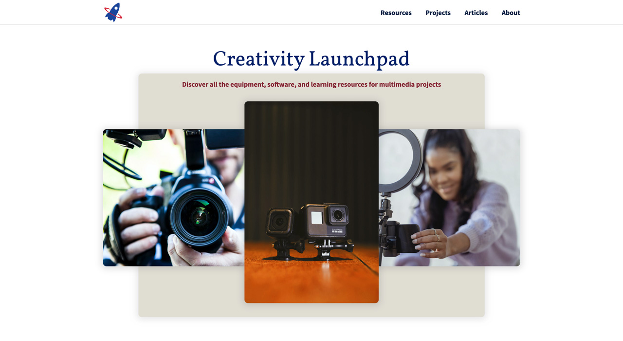
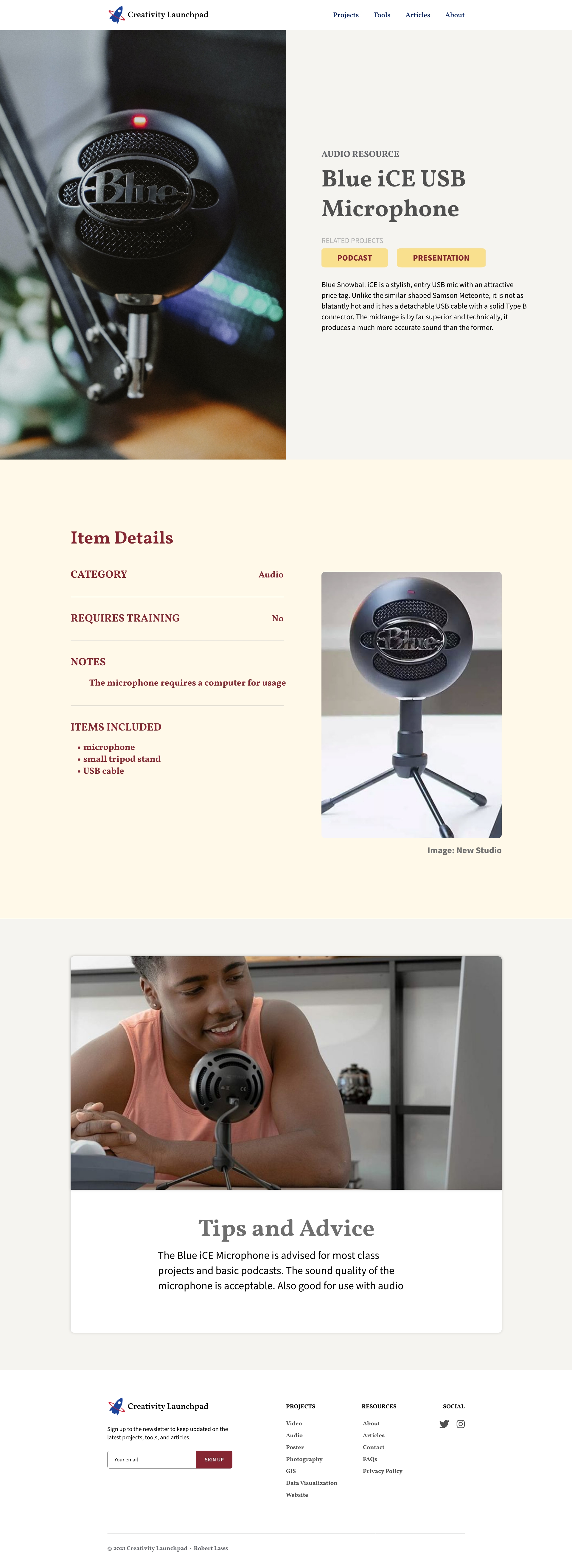
Creativity Launchpad - Project Website Homepage
Technologies Used
The project requires a wide range of technologies to create the website. First, the website data is stored in the JSON file format and loaded dynamically using asynchronous requests. Once loaded, the data will be displayed on the website and make use of modern layout techniques such as CSS Grid and Flexbox. A rich range of semantic HTML will be used in conjunction with WAI-ARIA roles and properties to enhance website accessibility. The website will also make use of ES6 JavaScript features, particularly array methods, to allow users to filter and re-organize website data. Finally, the stock photos used in the website are from the free stock photo websites: Unsplash, Pixabay and Pexels.
UX Research
The UX research phase of the project focused primarily on speaking with potential students of the website. In this case, the target audience will be university students who have assignments that require use and creation of multimedia tools. A student may be assigned or voluntarily choose to use multimedia to fulfill their assignment requirements, but may not necessarily know how to start, what tools are available, and what workflows make the most sense for their project. A student with these needs and desires is the precise target audience for the website.
After speaking with students who can fit into this category of potential audience for the website, it’s possible to build a typical persona representing the target audience. The research from building personas shows that the most likely user of the website wants something that provides essential information about what resources are available, what their capabilities and features are, and how best to use them, especially for complex projects.
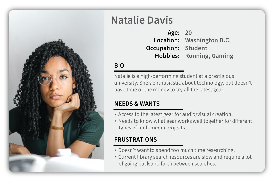
Persona - College Student
Doing UX research, even on this most basic level, provides invaluable information about how the website can be designed to meet the needs of the target audience. This addresses the central reason for doing UX research, because it can provide insights from real users that is more helpful than a designer assuming he or she knows what the user wants.
UX Exploration
Building on the UX research phase, the UX exploration phase was able to construct several low-fidelity wireframes to begin experimenting with designs that could meet the needs of the user. The home page wireframe places focus on the resources a user may want to explore. At this point of the design, the focus is on getting the information to the user immediately - as reflected in the grid of resources that take up the majority of the page. The idea is that users can view and select a resource to learn more about as soon as they load the website.
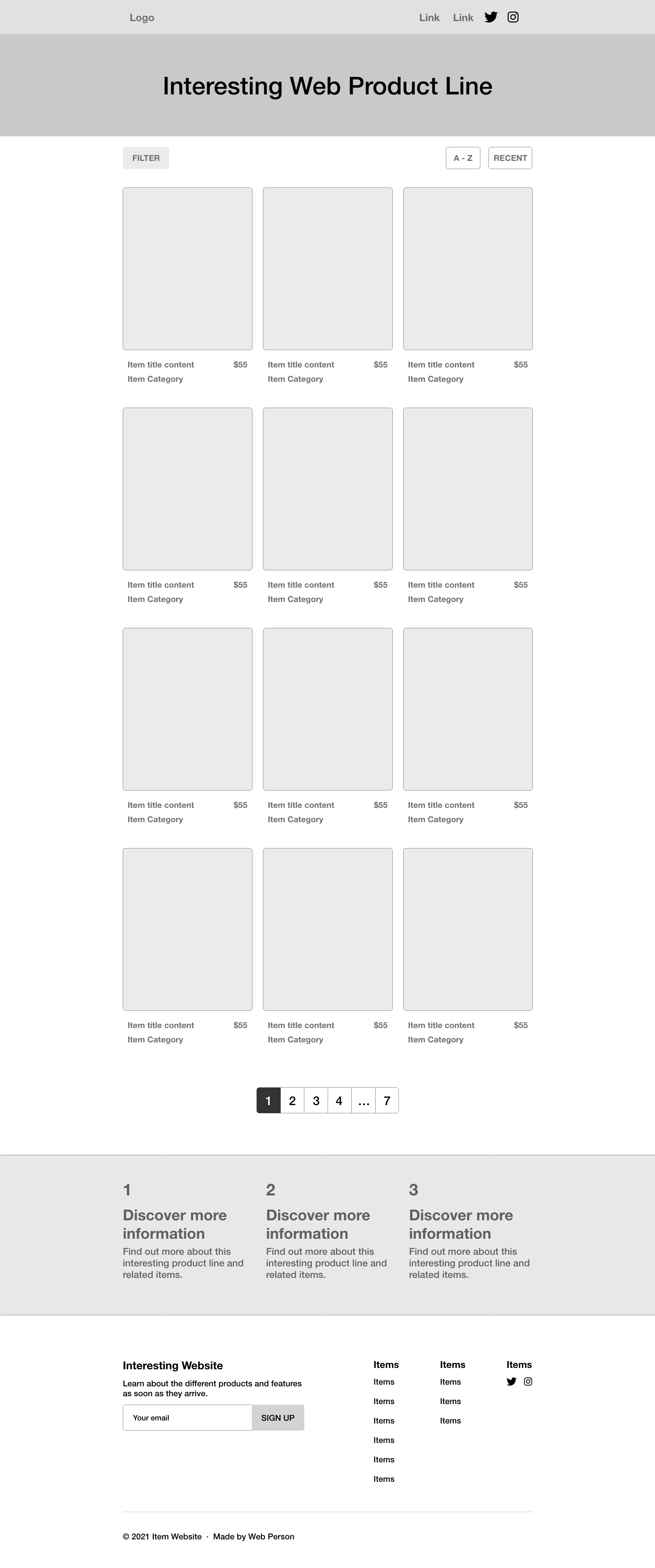
Wireframe - Home Page
Once a user selects a resource they want to know more about, the user is brought to the resource page. The resource page exploration focuses on combining information with visual examples of the resource in use. The idea is to provide information, but also create some visual appeal that could reflect the younger target audience appreciation of a bold visual design.
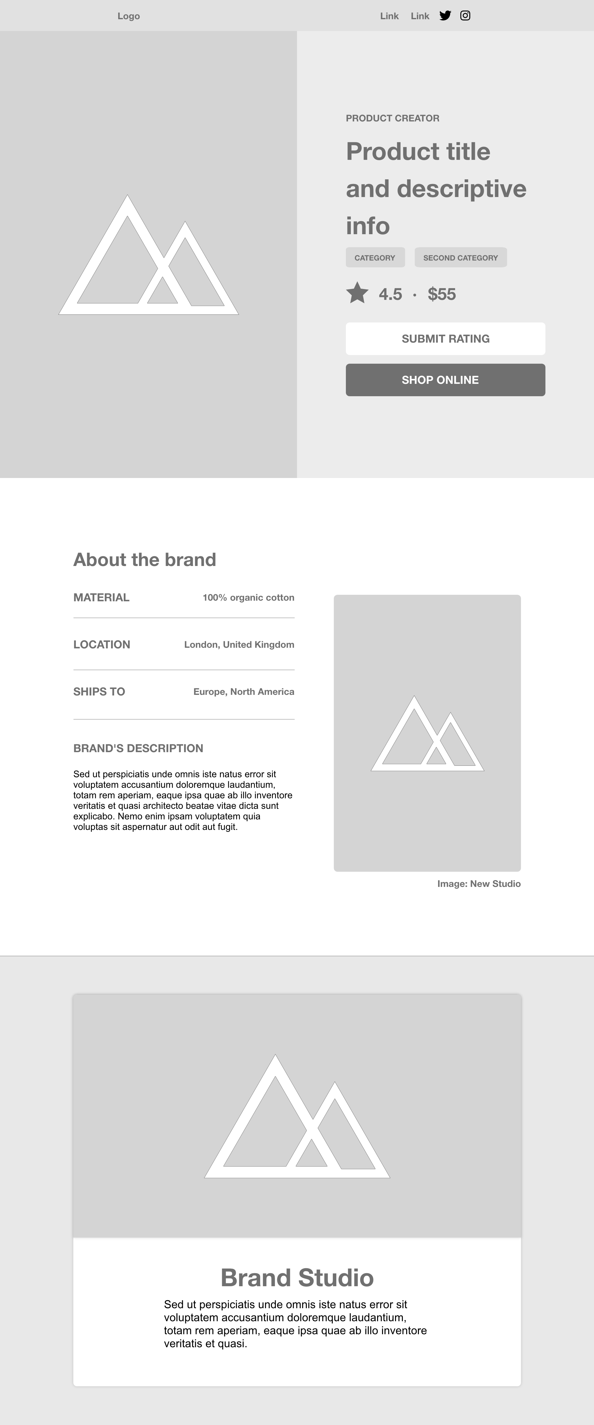
Wireframe - Resource Page
Information Architecture
The information architecture of the website aims to reduce the number of pages and concentrate on the most important information to the user. Since the UX research showed that users want to spend more time exploring resources and viewing examples of how they can be used in projects, the information architecture prioritizes this goal in the website structure.
The following information architecture was proposed for the website:
-
Home Page
- All resources with links to individual resources
- All projects with links to individual projects
- All articles with links to individual articles
- About the website page
The individual resource pages will includes links to the project pages based on projects that utilize a particular resource. Likewise, the individual project pages also will include links back to resource pages based on the resources used in a particular project. The inter-connectivity of the different parts of the website reflects the emphasis on the connection between resources and projects, vice versa.
UX Design
The UX design phase built upon previous phases - incorporating the more clearly defined information architecture structure into the design at this point. The design also builds up the UX exploration phase introducing well-defined assets that include a foundational color scheme, typography, and website icons. Whereas each includes elements of experimentation, they are also chosen with the intent to be used the actual assets that will be used in the website.
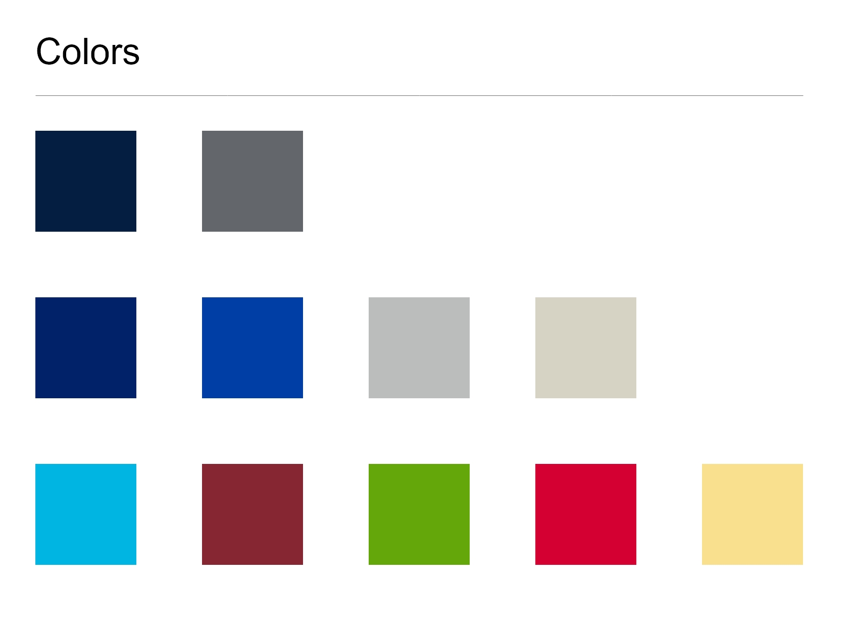
Color Palette
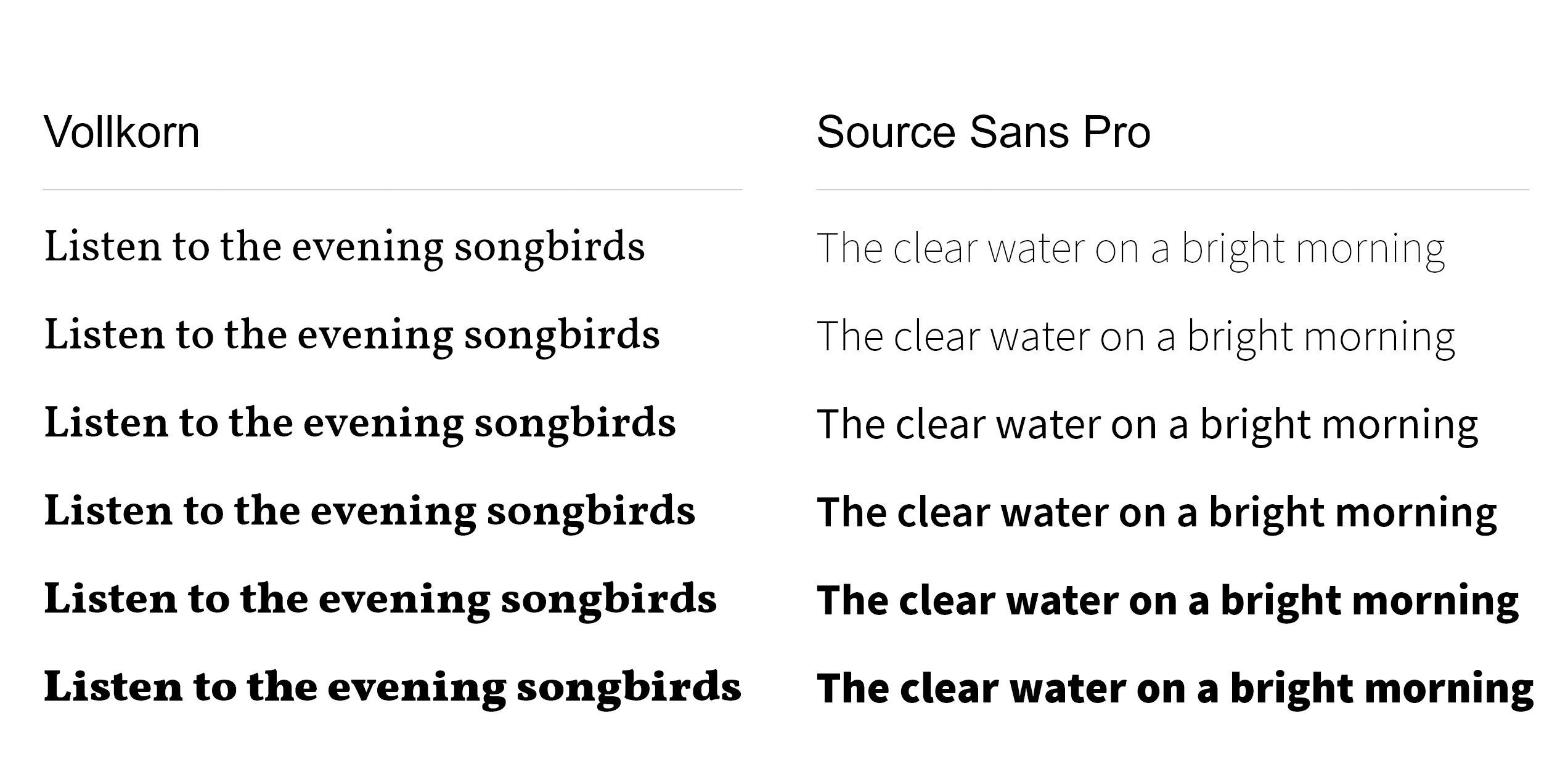
Typography
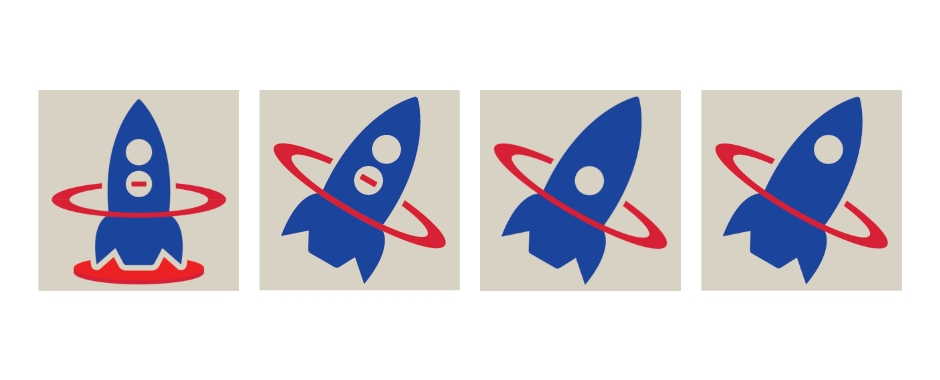
The logo design reflects an evolution in the design and a link to the spirit behind the website. The idea of a Creativity Launchpad is meant to evoke a starting point on a journey of creativity. The website’s goal is to help “launch” students on their creative journey and provide a starting point for the steps they will take to choose what type of creative project they want to do and what tools they will use.
The logo design shows an evolution in the idea behind these themes. Starting from a design that has a rocket sitting vertically on a launchpad, the design moved into a more active version of a rocket in motion. The rocket passes through a ring to suggest motion and progress. The colors for the logo are based on prominent colors from the chosen color palette.
Logo Design
Making further use of the website assets, the full prototypes of the website design were able to take shape. The result was a design that makes use of the colors, typography, logos, and sample content that reflected the website that would be built.
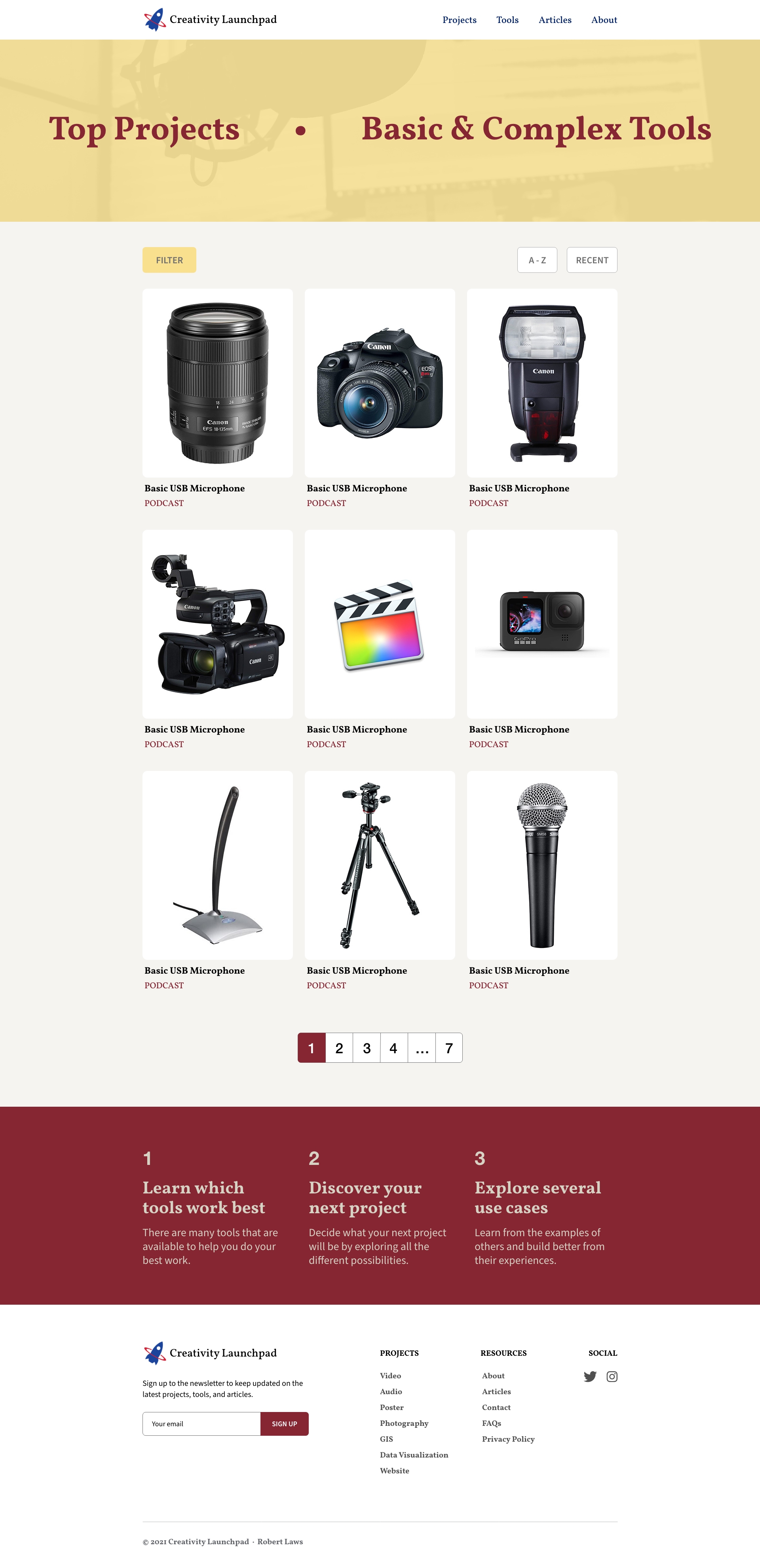
Prototype - Home Page
The design more clearly shows the bold approach to the resource page, which would inspiration for the design of other pages on the website.
Prototype - Resource Page
Content Development
One of the most challenging aspects of the project was the content development. The website would require content for individual resources - like cameras, microphones, software, etc. Each resource would include descriptive information about the resource as well as in which projects it could be used. The content development for resource and projects was built upon the information architecture definitions for the website and incorporated the interconnections between resources and projects in the content development. The result was that each resource needed to include as list of projects that made use of a controlled vocabulary of projects. In this way, the information architecture of the website was used to develop the data structures for the content development.
The result was a linkage between projects and resources. Each resource could be used in one or more projects. Articles, on the other hand, would not have any relationships with either resources or projects as reflected in their data structures.
Each resource, project, and article would also make use of one or more images. The images were primarily found on the websites Unsplash, Pixabay, and Pexels, which are great resources of royalty-free stock photos.
Development
Although the design and content development of the website were challenging, the developmental phase of the website presented multiple complex challenges as well. These challenges focused around issues like dynamically loading data from JSON files, adding interactivity to the website - particularly in the ways a user could filter and sort content, applying the design to the website through layout and CSS styling, and verifying that the website was fully compliant with accessibility standards.
Semantic HTML
Websites benefit from use of semantic HTML. The benefits come from providing greater transparency to the intent of content within the website as well as aiding in accessibility. Use of elements such as header, nav, main, article, aside, footer, and the heading elements help to build a well-defined website outline and highlight more or less important content. For example, the HTML structure of the main sectioning element on the resources.html page reflects it’s prominence and the sectioning of content.
<main id="main-content" class="site-main">
  <section class="title-section">
    <h1>All Resources</h1>
  </section>
  <section class="main-buttons">
    <div class="button-group">
      <a
        id="filter-button"
        href="#"
        name="open-panel-button"
        class="button blue margin-right"
        >Filter</a
      >
      <a id="a-to-z-button" href="#" class="button outlined">Sort A - Z</a>
    </div>
    <div class="button-group">
      <input
        id="resources-search"
        class="margin-right"
        placeholder="Search Resources"
        type="text"
      />
      <a id="clear-search" href="#" class="button outlined">Clear</a>
    </div>
  </section>
  <section class="cards-section">
    <div id="cards-total" class="cards-total"></div>
    <div id="cards-container" class="cards"></div>
  </section>
</main>
The main content components of the main section are the title, buttons, and content cards. These are each isolated by a section element, which reflects their status as discreet pieces of content within the main content of the website.
Layout with CSS Grid and Flexbox
The challenges of creating an attractive and responsive layout were much more difficult before CSS Grid and Flexbox were available and widely supported by different browsers. Both offer good ways to handle complex layouts, and when used in combination they can solve most layout challenges. One way that CSS Grid is applied for the website is with the layout of the resource cards on the resources.html page. Here, the cards are laid out in a grid with three columns when in the width is for desktop screens. As the screen size decreases, the layout adjusts to accommodate the smaller screen size and moves the cards into two columns and finally a single column for mobile layouts. This is achieved with the auto-fill property of the grid. This property instructs the grid items to fill in the available space as specified by the minmax() function. Once the multiple grid items can no longer fill the space within the constrain of the minmax() function, the items will be pushed to the next row. This is also a great way to introduce a responsive design to the website without needing media queries.
.cards {
  display: grid;
  grid-template-columns: repeat(auto-fill, minmax(300px, 1fr));
  grid-auto-rows: auto;
}
Flexbox can achieve similar responsiveness by making use of the flex-wrap: wrap property. This property allows the flex items to wrap around the container. Similar to the above example for CSS Grid, this property will allow flex items to wrap if there is not enough space for all the items to fit in one row. This feature is utilized for the buttons used to filter resources on the resources.html page.
.main-buttons {
  padding: 2rem 0 2rem;
  display: flex;
  flex-wrap: wrap;
  justify-content: space-between;
  align-items: center;
}
Finally, the stylesheet makes extensive use of CSS custom properties to define different properties that can be utilized and change based on media queries. For example, font sizing can be defined through CSS custom properties and applied to elements, which will then adjust without needing to add a separate media query just for the element.
/* Text Sizing */
:root {
  --h1-heading: 3.2rem;
  --h2-heading: 3rem;
  --h3-heading: 2.8rem;
  --h4-heading: 2.6rem;
  --h5-heading: 2.2rem;
  --h6-heading: 2rem;
}

@media (min-width: 1200px) {
  :root {
    --h1-heading: 3.2rem;
    --h2-heading: 2.8rem;
    --h3-heading: 2.6rem;
    --h4-heading: 2.4rem;
    --h5-heading: 2.2rem;
    --h6-heading: 2rem;
  }
}

h1 {
  font-size: var(--h1-heading);
}
This helps to simplify changes based on media queries and standardizes how elements behave based on definitions in just two lines of code within the CSS.about-content
JavaScript
The website makes extensive use of JavaScript to handle content data loading and functionality of the website. Most of the data for the website is contained in JSON files. Each JSON file is loaded into the page dynamically by calling an asynchronous fetch() function. The fetch() function returns a promise, which is then handled by another function to load the data as an array of objects. For example, the following code fetches the projects.json file and loads the data into a projectsList array.
const getProjectsData = async () => {
  const response = await fetch('./data/projects.json');

  if (!response.ok) {
    const message = `An error has occurred: ${response.status}`;
    throw new Error(message);
  }

  const data = await response.json();
  return data;
};

const getAllProjectsData = () => {
  getProjectsData()
    .then((allData) => {
      projectsList.pushWithEvent(...allData.projects);
    })
    .catch((error) => {
      document.querySelector(
        '#main-content'
      ).innerHTML = `<div${error.message}</div>`;
    });
};
JavaScript ES6 array methods are used throughout the code to do things like filtering, sorting, and searching. For example, the following code searches the titles of an array of all resources to find a match for the search query. This is done using the filter() method in combination with the includes() method to determine if the title string includes the words used in the search query.
const searchResources = () => {
  let searchMatches = [];

  if (searchTerms.length > 0) {
    searchMatches = resourcesList.filter((resource) => {
      return resource.title.toLowerCase().includes(searchTerms.toLowerCase());
    });
  }

  return searchMatches;
};
Accessibility
A very important aspect of the website is its accessibility features. One important feature is controlling tab order on a side panel that is revealed when a user clicks on the filter button. Once the side panel is opened, the user can either close it with a close button, check different checkboxes for a filter to be selected, or click on a button to reset all filters. It’s important to apply the concept of tab trapping to keep a user with a screen reader inside the panel until they choose to close it. If this is not done, a user will tab through other parts of the web page without being able to close the panel.
document.addEventListener('keydown', function (e) {
  if (panelOpenState) {
    let isTabPressed = e.key === 'Tab' || e.keyCode === 9;

    if (!isTabPressed) {
      return;
    }

    if (e.shiftKey) {
      // if shift key pressed for shift + tab combination
      if (document.activeElement === sidePanelCloseButton) {
        resetFiltersButton.focus(); // add focus for the last focusable element
        e.preventDefault();
      }
    } else {
      // if tab key is pressed
      if (document.activeElement === resetFiltersButton) {
        // if focused has reached to last focusable element then focus first focusable element after pressing tab
        sidePanelCloseButton.focus(); // add focus for the first focusable element
        e.preventDefault();
      }
    }
  }
});
In the code above, the keydown event is captured on the document while the side panel is open. If the user tabs to the last element in the panel or shift + tabs backwards, the focus is kept within the panel and not outside of the elements on the panel. This way, a user can tab through the panel without problem until they choose to close it.
Conclusion
This project introduced many interesting and complex challenges. The combination of creating a design, adding functionality, and implementing accessibility features covers a wide range of tasks web developers must consider when creating a website. The final result was a website that was visually appealing, designed to meet user needs, and included helpful functionality and accessibility features.