Introduction
In preparation for teaching a course on data visualization, the idea of making a companion website came into my head. The course focuses on learning core concepts of data visualization, including design, data handling, and analysis. These concepts seem straight-forward at first glance - like putting together a quick bar or pie chart - but there’s actually a large amount of complexity involved, especially to make effective data visualizations. Students will need to understand how data is created, stored, accessed, and finally manipulated to build a range of visualizations that can form part of an analysis.
The Challenge
The challenge of the project is to design and develop a website that can demonstrate the idea of how data is created, stored, and accessed, while also serving the purpose of educating students about key data visualization concepts and providing resources that they can use in their study of the topic. Combining all of these various purposes for the website and making them all interconnected and interesting makes the project challenging.
The Solution
The solution is to design a website that replicates a real-world scenario of data collecting, storing, and accessing. In this case, an online store to place orders for cafe products. The data that is collected (and mocked-up) for the imaginary online cafe can then be used to demonstrate and teach core concepts of data visualization and analysis. The website would also double as a learning portal for course materials and content, dividing up topical areas of the course with examples using the online cafe theme and models. The resultant website will help students understand the process of creating data and analyzing it through data visualization.

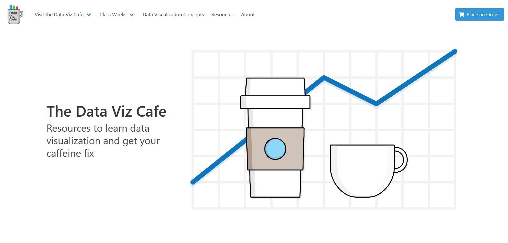
Data Viz Cafe - Project Website Homepage
Requirements
The following requirements make up different aspects of the goals of the website
Home Page
- Must have a ‘real-world’, marketing-focused look and feel
- Must execute a visual theme that combines an online cafe with data visualization motifs
- Must include call to actions to place an order
Navigation
- Must have links to the online store and data collection components of the website
- Must have links to the data visualization learning sections of the website
Online Order
- Must allow a user to select a location to place/pickup an order
- Must allow a user to browser and select products, place products into a cart, and submit orders
- Must have a visual component to show a user their order - ex. graphics of products purchased
Data Collection
- Must save user orders based on an “order” or “transaction” data model
- Must show users a listing (ex. in a data table) of transactions
- Must link back to a downloadable or connectable data source (ex. Google Sheets)
Learning Sections
- Must include a resources section that includes useful links, video (embedded or links), and presentational content
- Must include examples of data visualizations drawing from the website theme of an online cafe
- Must divide up content based on schedule of introducing the course content
UX Design
The design of the Data Viz Cafe website is meant to resemble a real online coffee shop, even though the coffee shop is fictitious. The concept for the home page is focused on marketing the fictitious coffee shop with a hero image at the top of the page and a mix of descriptive information about the website concept and call-outs highlighting top features of the website.
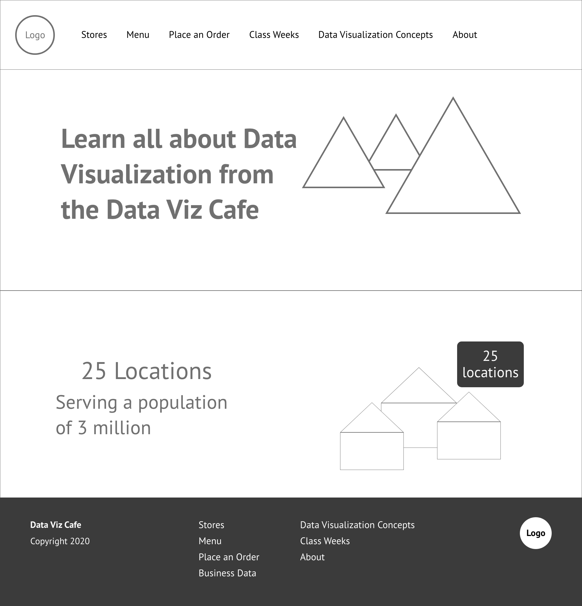
The wireframes for the design reflect the marketing focus. The home page wireframe includes the concept for the hero section and a secondary section with call out text and another image.

Wireframe - Data Viz Cafe Home Page
The navigation for the site went through an evolutionary process. The first version positioned the site logo in the center of the header with the navigation split to the left and right. This made sense at first because the content of the site is thematically divided between course support content and the pages that formed the store front including descriptive information for the coffee shop locations, menu choices, and order form.
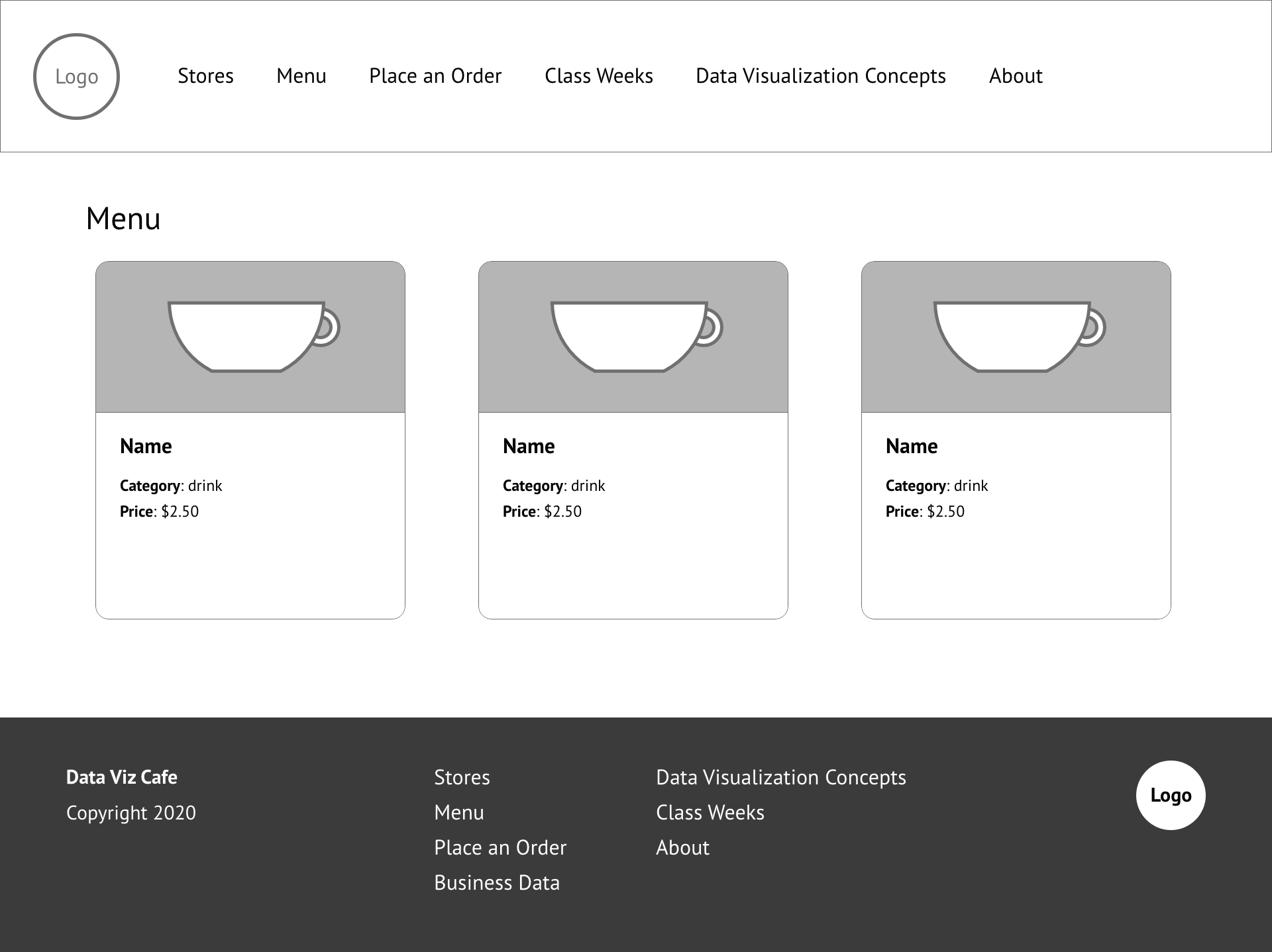
The subpages for the store front part of the website is consistent with the home page focus on marketing. For example, the menu listing page makes heavy use of imagery in a grid layout, each menu item laid out in a card component containing an image and descriptive information.

Wireframe - Data Viz Cafe Menu Listings
The course content pages place much more focus on textual content, including lists of resources, outlines of topics covered in each class week, and course topic definitions.
The design of the site is made using the Bulma CSS Framework. The main attraction of using Bulma is the component and element features, especially the modal, that sped up the design process. There did some to be a lack of a full set of responsive design features, but this isn’t a major problem since the site isn’t implementing an overly complex design.
Information Architecture
The website information architecture is not complex. It consists of a home page with single level children pages. The store front portion of the website is made up of informational pages for the shop locations and the menu listings. There are also pages for placing an order, reviewing data, and viewing data visualizations. The course instruction portion of the website consists of a separate page for each of the 5 weeks of instruction and pages listing data visualization resources and key concepts and definitions. Finally, there’s an About page.
The back end requirements are mostly related to the store front portion of the website. When placing an order, there are logical connections between the shop locations, menu items, and creating an order. The order submission references key values for locations and menu items. However, this isn’t based on a database running in the background. The data is stored locally as json files.
Development
The development for the website makes use of several different libraries and a connection to Google Sheets to save orders placed on the site. The site is written with React and makes use of the create-react-app build utilities.
React Features
The most prominent and interesting React features for the site are React Hooks to handle state management through the Context API with useContext and the useState, useCallback, and useEffect hooks.
Ordering Process
The React features mentioned above are all put to use on the Order page. The ordering process includes selecting a order location, one or more menu items each of which have a order quantity of one to four and finally choosing a drive thru option if the location has this feature. To do this, I make use of local state with the useState hook to populate a menu choices array.
const detectMenuSelection = useCallback(
  (menu, selectedQuantity, cardSelected) => {
    if (cardSelected) {
      setMenuChoices((prev) => [
        ...prev.filter((item) => item.id !== menu.id),
        {
          id: menu.id,
          title: menu.title,
          selectedQuantity,
          total: parseInt(selectedQuantity) * parseFloat(menu.price),
        },
      ]);
    } else {
      setMenuChoices((prev) => prev.filter((item) => item.id !== menu.id));
    }
  },
  [setMenuChoices]
);
When a user clicks on a menu option, the detectMenuSelection function is triggered. This function takes in the menu item selected, the quantity for the menu item, and whether or not the menu item is being selected or unselected. In situations where the menu item is being unselected, the function removes the item from the local state. If the menu item is being added, the function will first remove the menu item from state then re-add it with update information about the quantity selected and total price based on the quantity.
Modals
The modal is implemented using the useContext hook. It functions on the Locations and Menu listing pages. When a use clicks on the location or menu item, a modal appears with more information about the selected location or menu item. To implement this, the modal state takes in several pieces of information.
const initialState = {
  active: false,
  selectionGroup: null,
  selectionObject: null,
};
The initial state takes in an active boolean value, which is used to toggle the modal on or off, a selectionGroup string value used to indicate either the location or menu group, and a selectionObject which is an object with the details about the location or menu item.
To update the modal state, an updateModal function is called using context with the group string value and the object with information about the location or menu item.
const updateModal = useCallback(
  ({ group, obj }) => {
    dispatch({ type: UPDATE_MODAL_ACTIVE, payload: { group, obj } });
  },
  [dispatch]
);
The modal is used on the Locations and Menu pages. This is done with the Effect hook - shown here from the Menu page. When the user clicks on a menu item, a local state of menuId is updated and triggers the Effect hook. This sends the group value of ‘menus’ along with an object pulled from a menu context state object.
useEffect(() => {
  if (menuId) {
    updateModal({
      group: 'menus',
      obj: menus.find((menu) => menu.id === menuId),
    });
  }
}, [menuId, menus, updateModal]);
The Modal component then detects the Modal context state change and updates the Modal to show or hide.
The website contained several other challenges including connecting to Google Sheets and performing reads and writes through google-spreadsheet a Google Sheets API wrapper for javascript projects.
Another challenge was implementing javascript to manage Bulma components like dropdown menus for the navigation. This includes adding click handlers to hide the drop for a navigation option is selected.
Finally, the home page uses React Reveal an animation framework to introduce the sliding animations on the home page and the fade animations on the order page.
Conclusion
The Data Viz Cafe website presented many interesting design and development challenges. It was interesting to implement a marketing-focused design that made use of text, call to action (CTA) features, illustrations, animations, and a store front component.
The website is also interesting for the educational aspects, which hopefully will help students taken the Data Visualization course in the Spring 2021.
