Introduction
The backstory
I’ve been working with code for nearly 20 years. My primary job during those 20 years has been as a librarian. Traditionally, librarians have come to coding due to a need as libraries become more and more dependent on technology within their field. I’ve gotten to the point where my interest in coding outweighs my interest in librarianship and I’m ready to transition into coding full-time.
The Problem
Throughout my career, I’ve spent a lot of time reading code, writing code, and helping others with coding tasks. This is fulfilling, but after the work was done I didn’t have a lot to show for my efforts as a coder. The problem this creates is that as an aspiring full-time web developer I need some way of recording and showcasing my work product.
The Solution
To remedy this situation, I’ve decided to develop a developer portfolio website. The goal of this website will be to provide a space for me to describe in detail my developer projects. It will also provide me a space to blog about my web developer experience and ideas. And finally, the website will include a space for my professional details - including a resume, contact information, and social media links.
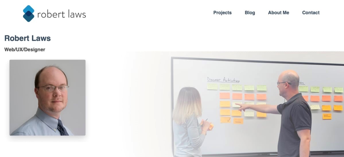
Project Website Home Page
Technologies Used
I hadn’t done too much work with a Static Site Generator (SSG) - this project gives me this opportunity. The benefits of a SSG are many, including diminished security risks, fast page loads, and use of sophisticated and well-supported software. I chose Jekyll as the main technology for this project - primarily because it is supported on GitHub Pages, where I want to host the site. Since I will likely be the only person working with the codebase, the limitations of using a SSG are not so significant. The content will mostly be written with markdown - and it’s good to get into regular use of markdown, so that’s an added bonus.
Requirements and Considerations
The list below reflects a preliminary assessment of the likely system requirements for the project. It’s anticipated that most of the preliminary requirements will be incorporated in the final requirements although possibly with some modifications. Additional requirements will be added that are necessary for the system to function properly. The listed requirements are meant to be as comprehensive as possible to reduce the amount of additional requirements added later.
- The project will consist of a website accessible through an HTTP address and will be viewable on desktop, tablet, and mobile devices with each offering an appropriate user experience.
- The website will have a home page that will offer navigation to important sections of the website, including projects, a blog, and professional information about the author. The homepage will also offer users “previews” of project and blog content through short lists with excerpts.
- The projects page will include a list of all the projects contained within the website, allowing users to select a project to view its details.
- The project detail page will include a contextual navigation that lists the components of the project and allow users to access those sections upon clicking the link.
- The project detail page will mix textual and visual content.
- The blog page will include a list of all the accessible blog posts beginning with the most recent.
- The blog post page will mix textual and visual content.
- The blog post page will include the minimum content of author, date, title, and post text for each post.
- Blog posts will have categories and tags listed when appropriate.
- The website will include a feature to allow users to view blog posts based on selecting categories and/or tags.
- The project and blog page will include pagination to allow users to view projects and blog posts in smaller numbers and proceed to another page to view more.
- The website will include space for ‘about me’, resume, and ‘contact me’ sections.
- The website will allow for speedy updating by utilizing a technology stack that favors this type of functionality.
- The website will have a contemporary look and feel.
UX Research
The project phase for UX Research was somewhat protracted since the website is mostly for my personal promotion and blogging. The primary users of the website are myself as a developer and potential employers or fellow developers. However, an extended UX Research phase is useful in the future since the website is similar to other general blogging or informational websites.
Personas
The persona for the website is based on myself as the developer. The core aim of the persona is to have an effective self-promotion tool via a website.
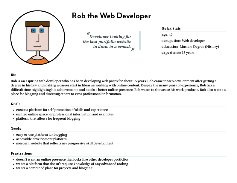
UX Research - Persona
UX Exploration
Before beginning the full design phase, exploration is very helpful for refining initial ideas. This process allowed me to “visually catch” some important considerations that impact the design - especially spacing, important content pieces, and a rough idea of how imagery and text will be laid out together.
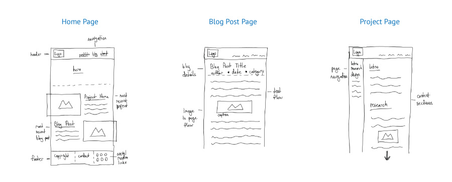
UX Exploration
Information Architecture
The website structure and major content areas formed the backbone for the website design. The major components of the website are the blog and projects. The website’s purpose is to showcase examples of work in the projects and provide commentary and reflection on important issues in web design/development in the blog. Other important components of the website are contact, biographical and resume information. Finally, pages that group content based on categories and tags have been added, although they weren’t considered in the initial sitemap. Important social media account links were included in the original sitemap.
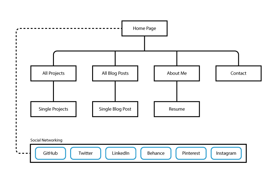
Sitemap
UX Design
Wireframes
The UX Design phase focused on creating a design for the website that was distinctive, professional, and easy to navigate. The site isn’t overly complex, but still needed to have a well thought-out design. Using the sketches and sitemap from the exploration and information architecture phases, wireframes were built. A desktop and mobile version of the home page were developed as were a mobile version for the blog post and project detail pages. Adobe XD was used to create the wireframes for this project.
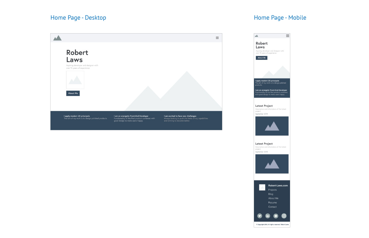
Wireframes - Home Page - Desktop and Mobile
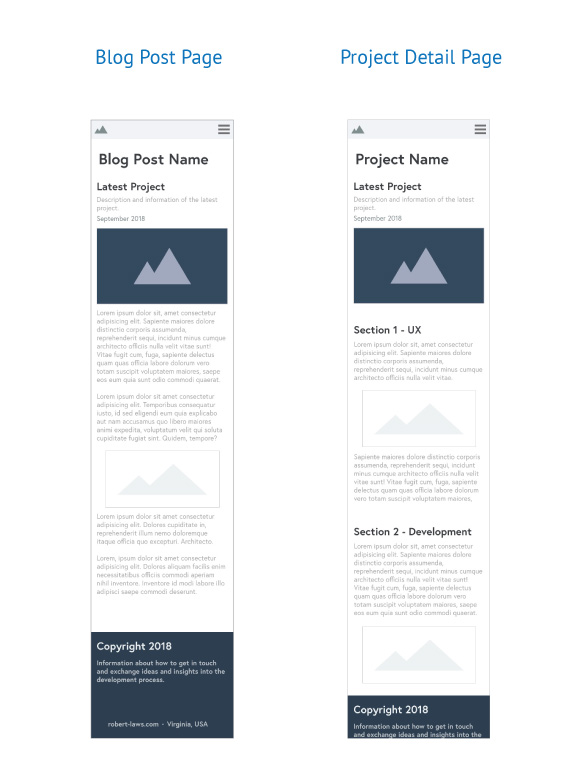
Wireframes - Blog Post and Project Detail
Content and Style Guide
The content and style guide was created to give clarity to the finalized guidelines that would be used for the website. This was especially important for the branding and logo design.
Developer Portfolio - Content and Style Guide - PDF
Development
Development of the website is done using the Static Site Generator (SSG) Jekyll. This technology is purpose-designed for blogging, which is a top requirement for the website. Jekyll is also great for creating web pages that don’t require a database to serve content. The appeal of Jekyll for this project is that the technology supports the markup language Markdown. This means that both blog posts and static pages can be written using Markdown and this will help with quicker content development.
HTML5, Flexbox, BEM and Sass
Styling the website is done with CSS. Although the website isn’t overly complex, it still requires a lot of styling, which can become complex. Sass helps to minimize the problems that come with complexity by introducing things like reusable variables, nesting of elements and style definitions, and mixins for repeatable styling logic. Sass coupled with BEM - which stands for Block Element Modifier - is a methodology for designing web sites with re-usable and modular components. Finally, Flexbox makes designing layouts much easier than without it. For this website flexbox is appropriate due to the fact that the website is not overly complex and doesn’t require something like CSS Grid.
Using HTML5 as a foundation for devising components - such as the blog post shown below - describes an individual blog post entry that can be reused for every blog post on the webiste. The HTML5 article element consitutes the content that is repeatable and is defined by the class “blog-post”. All subsequent elements are based on this block definition and extended by the element - such as with “blog-post__author”. Finally, an element can make use of a modifier, such as with “blog-post__tag–primary” when there’s some difference from the baseline element, but not a distinctively new element.
<article class="blog-post">
  <header class="blog-post__header">
    <div class="blog-post__category">Categories...</div>
    <div class="blog-post__title">Title</div>
    <div class="blog-post__author">by author</div>
    <div class="blog-post__meta">
      <p class="publish">Published Date</p>
      <p class="update">Updated Date</p>
    </div>
  </header>
  <section>
    Blog Content
  </section>
  <footer class="blog-post__tags">
    <p class="blog-post__tag--primary">Post tags</p>
    <p class="blog-post__tag">Post tags</p>
  </footer>
</article>
Example of BEM methodology for an blog post
Sass makes use of BEM methodology when developing the Sass files - such as the excerpt of the Sass used for the blog-post content shown below. Sass works well with HTML5 and BEM since it can be structured to mirror the component.
.blog-post {
  padding: 7rem 0;
  background-color: lighten($color-primary-dark, 79%);
  display: flex;

  &__content {
    flex: 6;
    display: flex;
    flex-direction: column;
    min-height: 40rem;

    @include xl {
      flex: 12;
    }
  }
}
Sass file utilizing BEM naming convention
Liquid Syntax
Another prominent aspect of Jekyll is the use of the liquid syntax for the templating aspects of the website. An example is the way developers can define categories Jekyll and access that content via liquid syntax. There is a lot of complex development that can be done using liquid, which adds to the power of Jekyll. In this project, there is extensive use of liquid to do things like pagination, creating and organizing collections of content, and creating reusable content.
Layouts and Includes
Finally, Jekyll makes use of includes to expose repeatable content for use in blog post and other pages. An example from the website is the use of an include for image content. The include can be called on website pages and information about the image and a caption can be passed to the include. The include is used on the blog page - using Sass in Jekyll in the following way to pass the featured image that is defined in the blog post front matter and using the caption “Web Developer in Action” in the sample below.
Jekyll is complex and takes time to learn, but has powerful features and has the added bonus of being supported by Github Pages - which hosts the content for access on the Internet.
Conclusion
The Developer Portfolio project was a great opportunity to learn the Jekyll technology and structure a website to promote my developer skills and knowledge. The things that were successful were making use of the power of Jekyll particularly for blog post creation and structuring project content. Jekyll also supports includes, which is an essential aspect of templating a website, which is a huge enhancement to developer efficiency.
The aspects of the project that I would revisit is not taking a mobile-first approach in development. What I learned is that it’s easier to begin with the mobile version and expand it into a desktop version rather than the reverse.
Overall, the website is a success and has allowed me to hone my skills, particularly in areas like Flexbox, Sass, the BEM methodology, and Liquid syntax. There’s room for improvement, but a good result for version 1.0.