Introduction
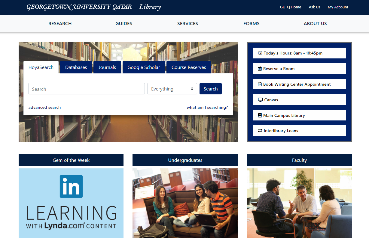
The library website for the Georgetown University in Qatar library needed to be redeveloped in 2019. It had become outdated and had problems with its responsiveness for mobile users. The projects introduced an opportunity to upgrade the website and use newer technologies. The website is used by students constantly and is essential for their success at the university.
The Challenge
The previous version of the library website, which I was replacing in this project, made use of an older CSS Framework (Bootstrap 3) and other technologies, that needed to be replaced and updated. This required a process of inventorying the existing website content - updating or replacing - and rethinking the overall site logical structure. Once the information architecture was updated the next challenge was to develop logical and reproducible components that would ultimately be inserted into a Drupal production environment.
The Solution
Although I don’t use all the features of Drupal, I do make use of the system of blocks to create regions on each page that are defined once and reproduced on several pages. Due to this feature, I choose to use a build system based on pug to replicate the same concept. In Pug, it’s possible to create content as includes that can be inserted into a layout for repeatable use. Unique content could then be developed for insertion into a content area for each page on the website.
The final build system chosen was Gulp. Using Gulp, tasks were run for Pug, Sass, as well as incorporation of Bootstrap 4. Running browser-sync also allowed for basic development testing and debugging.

Library Website - Project Website
Requirements
The following requirements formed the baseline of functionality for the initial release of the project.
- Must have a final implementation using Drupal
- Must implement accessibility standards for use by screen-readers
- Must be responsive, allowing for ease of use on tablet and mobile devices
- Must have solutions to route users to external resources via search boxes, links, etc.
- Must implement a corporate design in the look & feel of the website
UX Design
Because the library website’s look and feel were being updated with the redevelopment project it was important to create prototypes before beginning any coding. Prototypes allowed me to get a sense of the design feasibility before working on any coding.
The most import aspect of the design was to make use of the university corporate design colors, typography, and image usage. Beyond that the design was flexible.
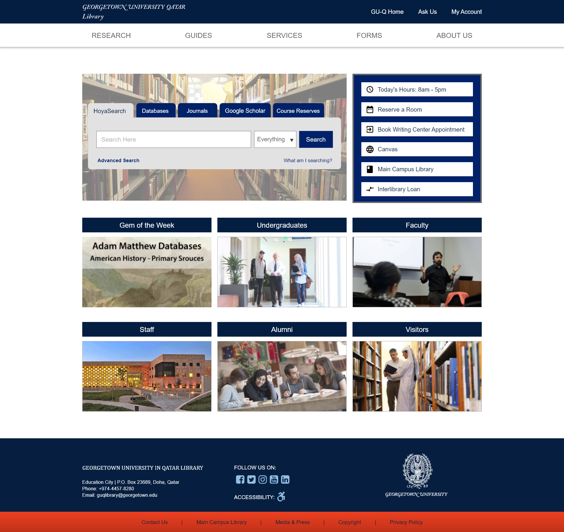
For a university library website the design is generally more conservative. For this website, it was important to have a clear design that focused users’ attention on the main search box. Beyond that, the design is uncomplicated and information-focused.

Prototype - Library Website Home Page
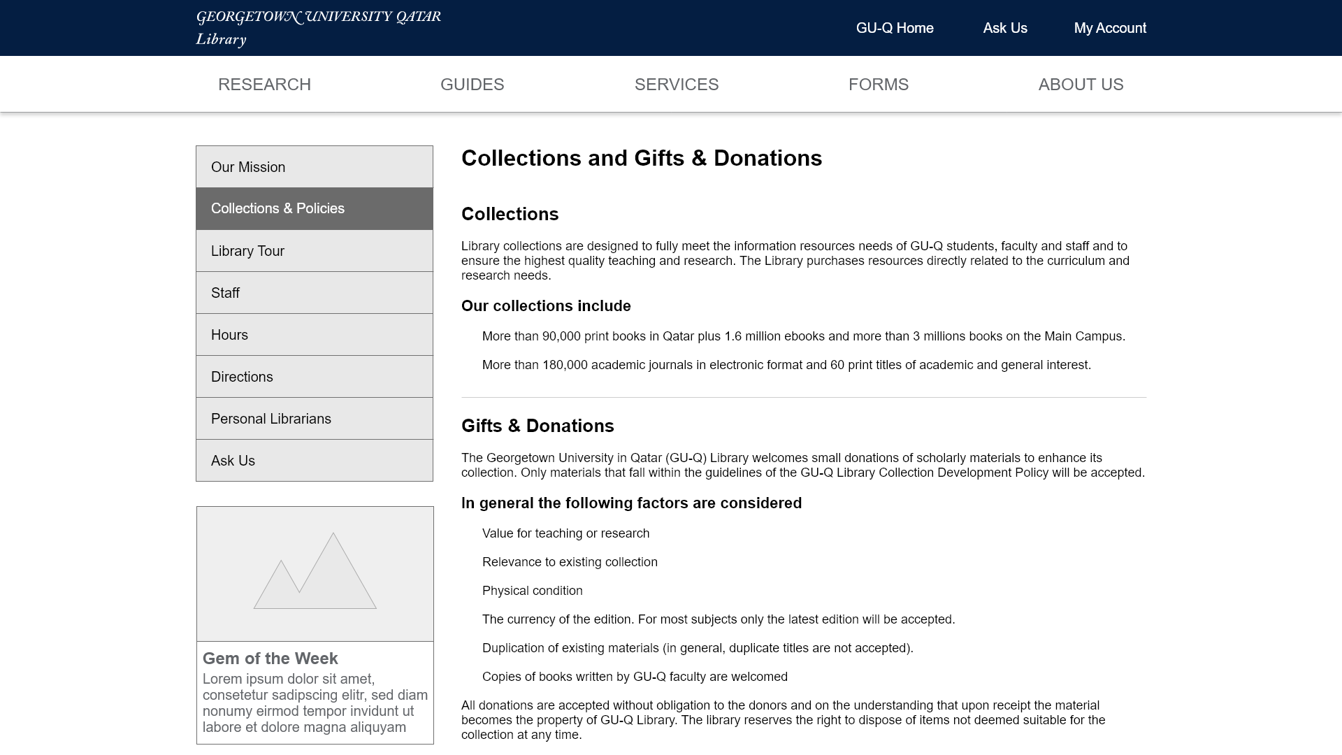
Sub pages have an added feature of a contextual side-bar on the left that provides links to related content. The sub pages also have a breadcrumb navigation and consistent headers for all pages on the site.

Prototype - Library Website Sub Page
The prototyping process was done using Adobe XD, which allowed for testing of some features such as the navigation.
Information Architecture
The website’s overall information architecture is not complex. From the home page there are no other pages that are linked deeper than one level. This allows for a simple structure that consists of five categories - research, guides, services, forms, and about - for all website content. The website does not make use of any external databases or data - and performs as a static site.
Development
The development phase of the project involved building the site in an environment using Gulp for testing and building html. The final html is then moved into place on the Drupal server.
The most challenging and interesting aspect of the developmental phase was creating mixins with Pug to create the side navigation bar for each sub page on the site. The feature works through use of multiple components. First, a yaml data object contains the different sub sections of the category - in this case the services category.
- var navServices = {'Borrowing':'borrowing', 'Renewing':'renewing', 'Interlibrary Loans':'interlibrary-loans', 'Course Reserves':'course-reserves'}
This data will be looped over inside the mixin, which will make each item a link unless the item is the same as the current page. The mixin is inserted within the pug template.
mixin side-nav(page, items)
  div(class="list-group d-none d-md-block")
    each val, index in items
      if page == index
        a(href=val class="list-group-item list-group-item-action active")= index
      else
        a(href=val class="list-group-item list-group-item-action")= index
The pug template is built using the Bootstrap 4 CSS framework. The development also focused on making use of the responsive features of Bootstrap, which are reflected in the use of column sizing for various display widths.
extends layouts/default.pug

block content
  +page-header('Renewing', 'Services')

  div(class="container content-page")
    div(class="row")
      div(class="col-md-3 content-page__side-nav")
        +side-nav('Renewing', navServices)

      div(class="col-md-9 col-sm-12 content-page__content")
        h4 Renewing

        h5 General Information
        p You can renew your library materials by signing into
          a(href="#" target="_blank") your account
          | and viewing your library record.
The developmental phase also employed use of Sass and was developed based on the BEM (Block - Element - Modifier) methodology for organizing CSS stylesheets. Although not extensive, some Javascript is also used for the website - including the tabbed search box on the home page and the ‘current hours’ feature that accepts customized hours display based on the date.
Conclusion
Although the library website is not a dynamic website that makes use of cutting-edge technology like React, it was still a challenging project. Making use of Pug for templates and Sass for the stylesheets (along with Bootstrap 4) provided enough challenges. Ultimately, the website is important since it is highly trafficked by students at the university and plays an important part in their academic success.
