Challenge Two - Blogging Website
The second challenge in the UX/HTML/CSS Design and Code Challenge series is another blogging website. In contrast to the first challenge, the inspiration website for this challenge is much more complex and offers opportunities to test out my skills. The website I used as the inspiration for this challenge is Pinch of Yum, a blogging website about food, cooking, and recipes.
Just like with the first challenge, the intent is to recreate the website through a process of building a design and then translating that design to HTML and CSS to produce a final working version of the inspirational website.
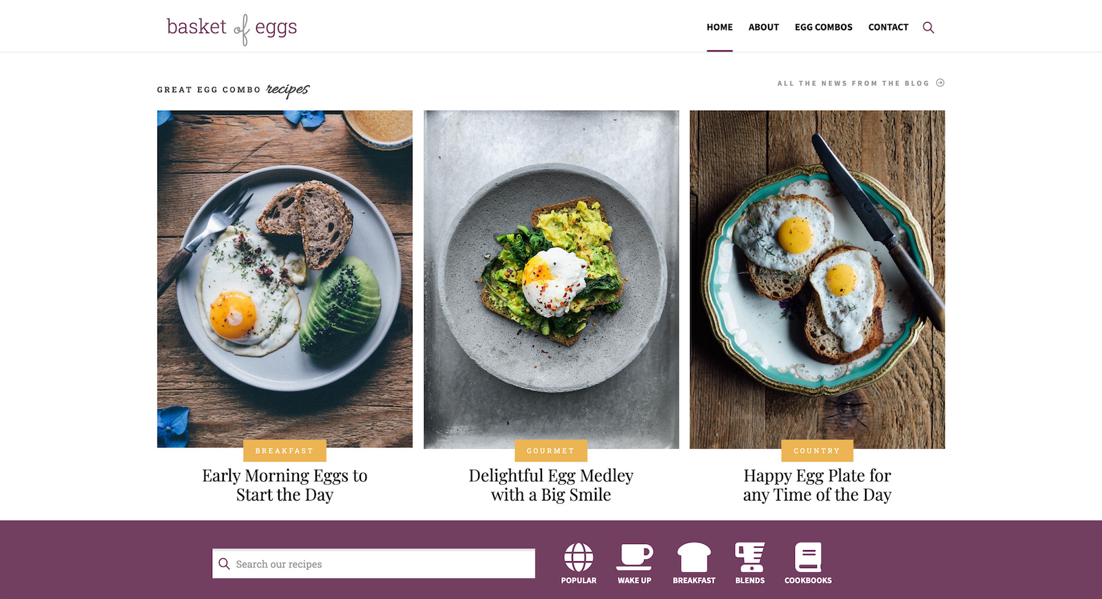
New and Interesting Hurdles
The first challenge was a simple blogging website, which had a fairly simple layout and design. The website from the first challenge had a header, a content area with blog post entries and an aside area, and finally a footer. The website for the second challenge presents many more sections and all having increased complexity than the first challenge. Of course, that’s what this challenge series is all about - finding websites that push my skills and creativity forward.
Specifically, this challenge included many interesting features:
- use of advanced typography - including type and icon fonts
- extensive (and varied) use of flexbox throughout the website
- different uses of positioning for complex image arrangements and element layering
- use of CSS custom properties (variables)
- use of HTML semantic sectioning elements
Additionally, the approach I took to both the design and development phases was based on applying atomic design principles. For this challenge, there were many different features that could lend themselves well to the ways atomic design. This approach works by breaking down a elements on a website into smaller pieces - or atoms - which are then used to build more complex pieces - molecules and organisms. These pieces are then placed within templates and pages to construct a final website.
The Design Phase
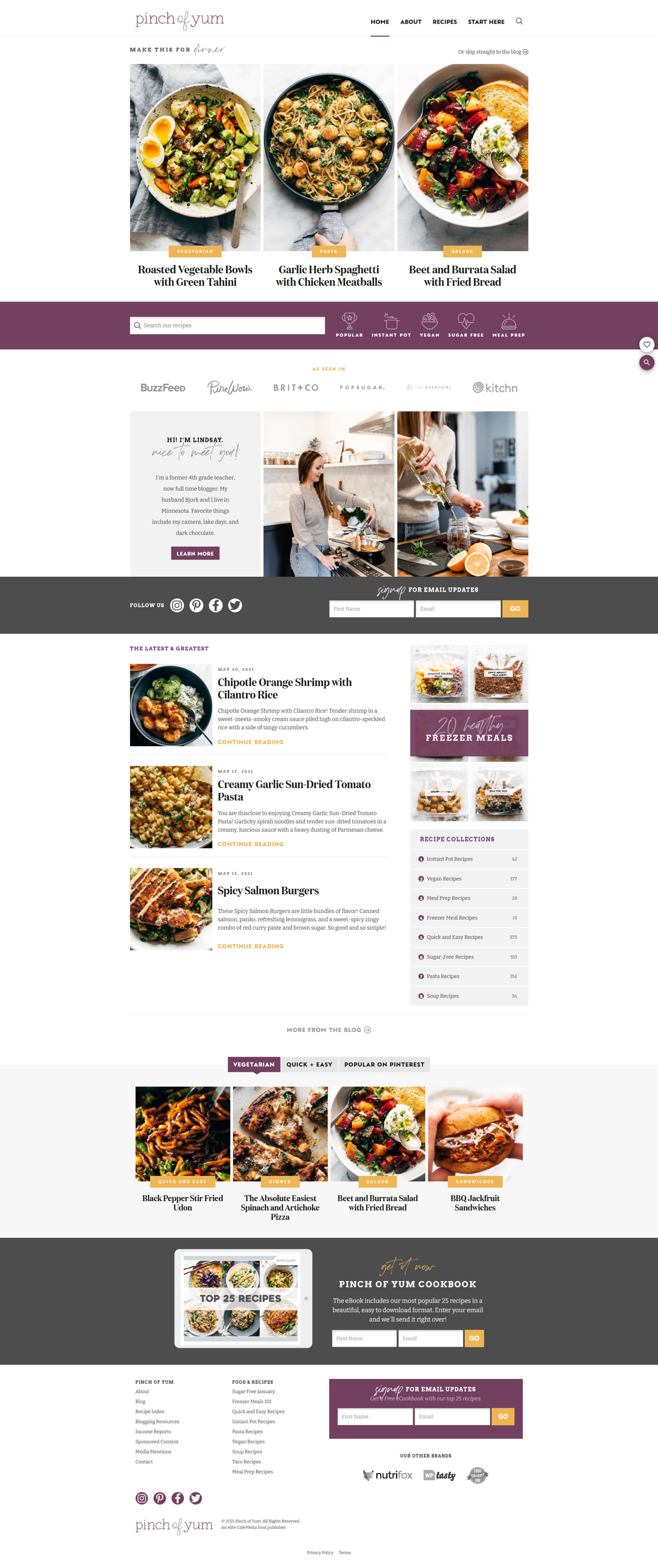
The design of the inspiration website was an interesting mix of different typographies, icons, text and visual content. The website also contains some basic form elements, a styled navigation, and interesting visual combinations of text and images together into a basic card-like component. The website had a little bit of everything to test my design skills.
The screenshot below is the inspirational website - pinch of yum. The design process began by examining this website.
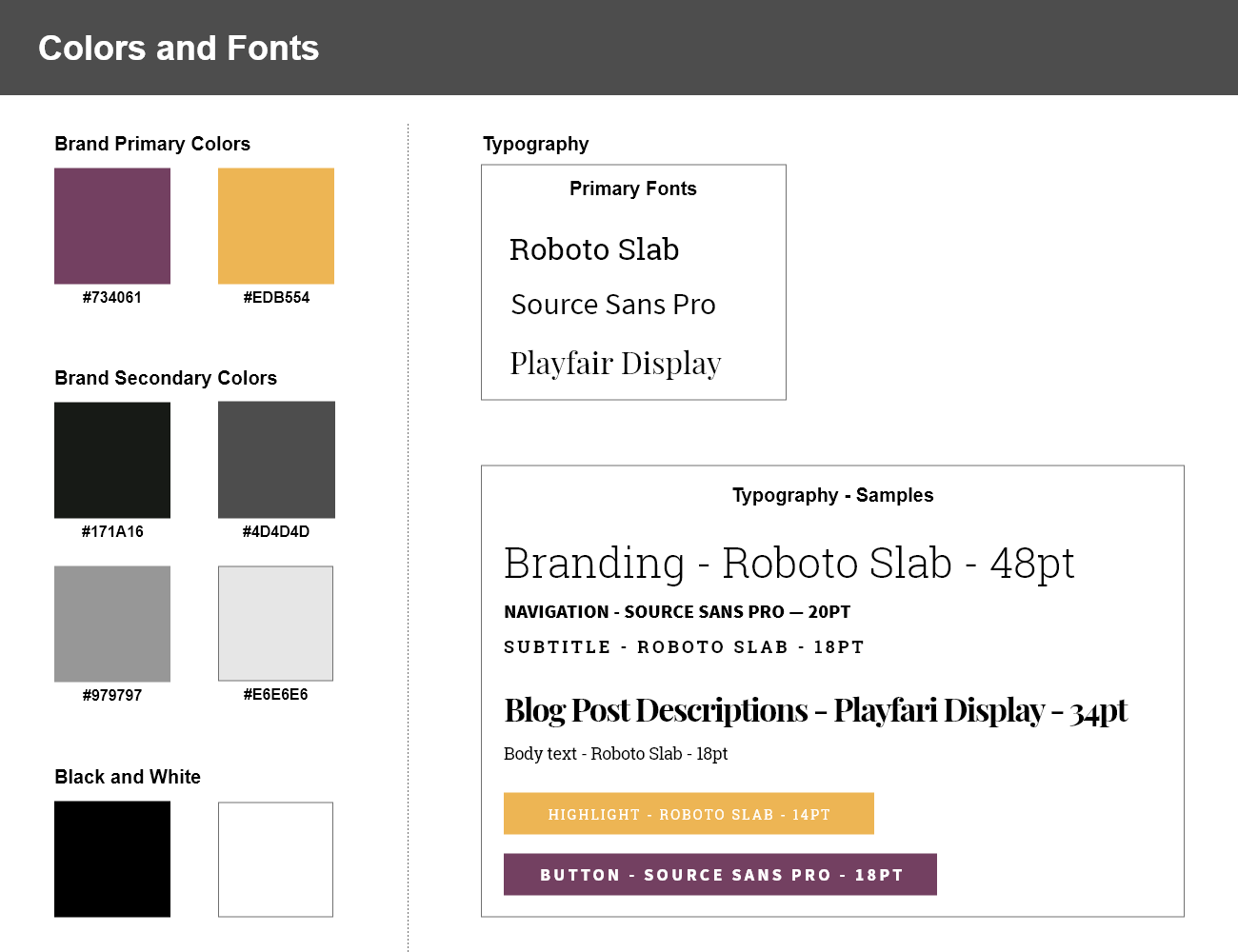
Extracting Colors and Fonts
The first part of the challenge was to examine the design of the inspirational website. With a full screenshot of the inspiration website in hand, I was able to sample the colors and build a color palette of 8 colors. The site had two main brand colors and a range of shades of gray as well as black and white. The typography was a nice mix of serif and sans-serif fonts and a cursive script. It wasn’t too difficult to inspect the fonts on the inspirational website, which weren’t freely available. The good news was that Google Fonts has many options and several that were good substitutes for the fonts used on the inspiration website. I choose Roboto Slab and Playfair Display for the serif fonts and Source Sans Pro for the sans serif font. I also chose Allura for the cursive font, which wasn’t too similar to the inspirational website, but was an acceptable option.
Finding Atoms and Molecules
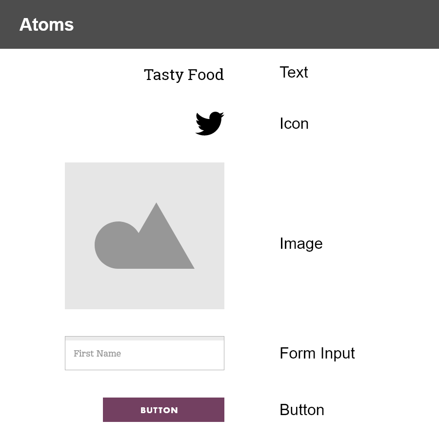
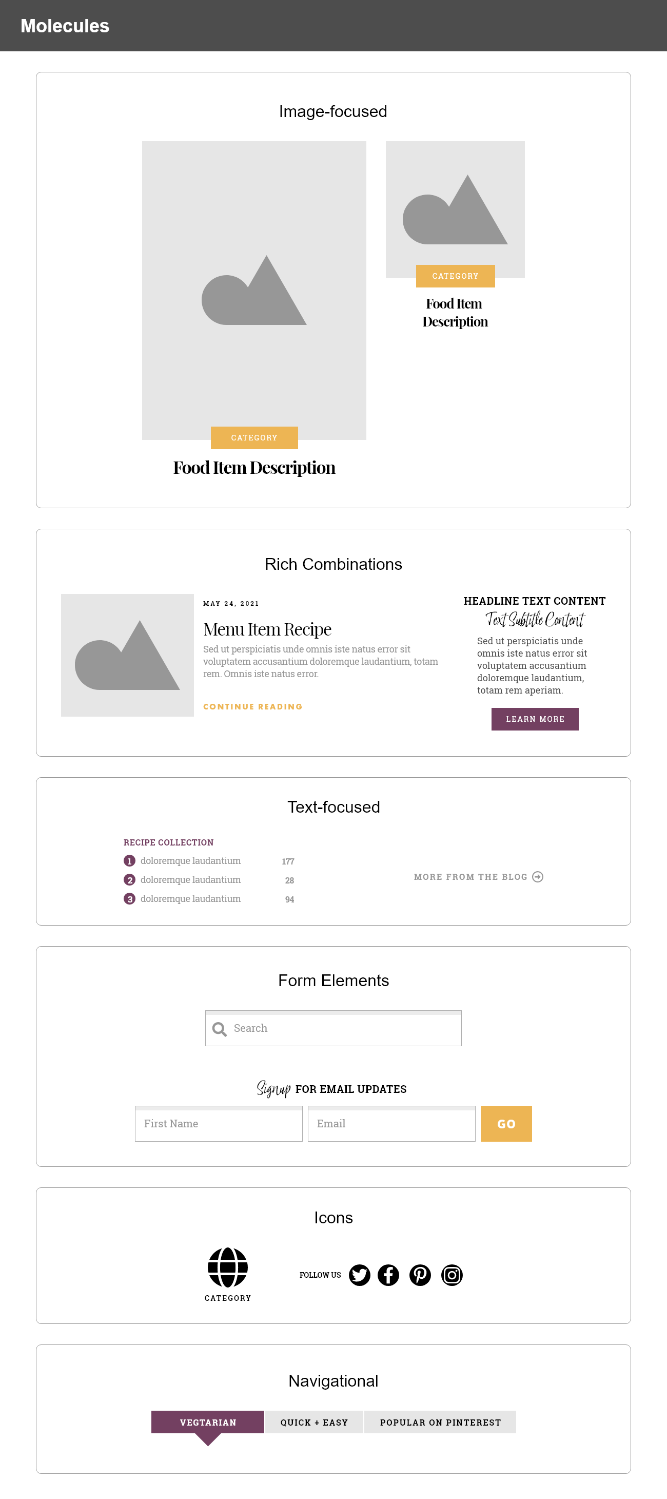
The next step of the design phase was to identify atoms and molecules on the website. Identifying atoms was straight forward - they included text (headings and body text), icons, form elements, images, and buttons. These atoms are typical of most websites. Combining the atoms into molecules is where it’s possible to create unique and interesting elements for the website. For example, the major visual elements on the inspiration website included a visual element that was a combination of an image and two textual atoms to create a combined visual element molecule. This molecule has two variations, a large and small version, which are both based on the same constituent atoms.
Other major molecules include the blog post entry, which is made up of an image atom and four text atoms. This molecule is repeated for a few blog entries on the page. Other textual content form molecules by combining text and other atoms (like buttons and list numbers) to form additional textual molecules. Forms come together in a similar way. The input for the search is combined with an icon and the email signup form is a combination of text, two inputs and a button to make up a more complex form molecule. The sign up form could even be considered as an organism since it combines all the pieces needed to make up a full-functional form that can be submitted.
Layout Analysis
After analyzing the colors, typography, and finding the different atoms and molecules within the original design, the next step was to look at the website layout and determine the best semantic layout structure for the website. This included some obvious choices, like the header and footer sections of the website, which were located in the expected locations. Less obvious were how to divide up other parts of the website, especially some of the large visual pieces, into sections that made sense. The visual section directly under the header served the similar purpose as a hero section - an eye catching visual area - although it wasn’t exactly like hero sections on other webpages because there wasn’t a clear call-to-action. Below this section were other areas that provided resources, information, and tools to the user. Under this was what I considered to be the main section of the website - where the individual blog post entries were located, along with an aside. Finally, the website concluded with some additional resources and a repeat of the sign-up form before ending with the footer.
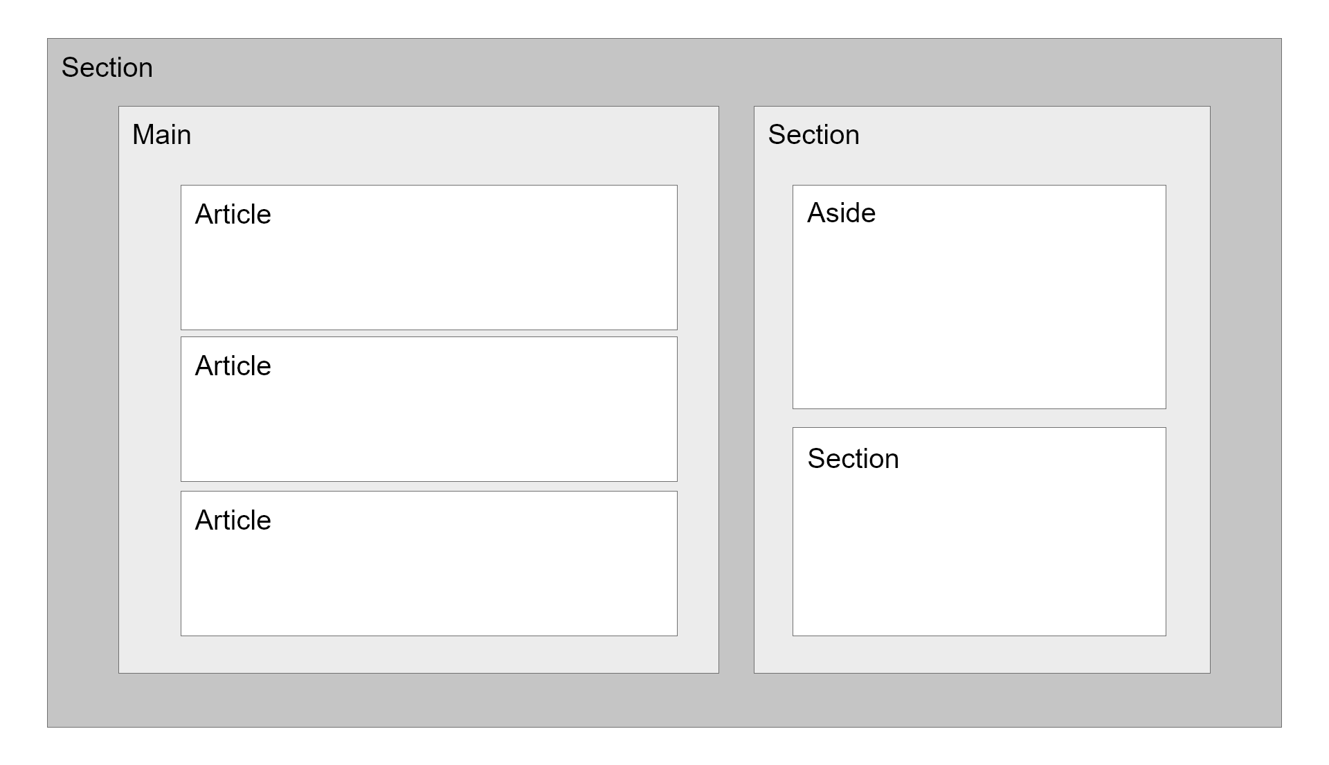
The most complex layout structure for the website was the area with blog entries and the aside content. The main content of the website is the blog post entries, which is why I chose the semantic element of <main> for this part of the layout. Next to the blog entries is a sidebar area with tangential content to the main content, which is the definition for use of an <aside> element. In the case for this website, use of an aside element is barely justified since the content is mostly content that forms lists or to a page of lists. All the same, the concept of using an aside makes conceptual sense here since the aside content is related to the main content. It’s okay to take this approach for a challenge. The image below is the final layout structure used for this part of the website.
Page Construction in Design
Finally, putting it all together - the atoms, molecules, organisms were placed into the layout section templates. Each section below represents a distinct part of the overall webpage.
Header

Hero
Search and Icons

Bio
Social and Newsletter

Blog Posts and Aside
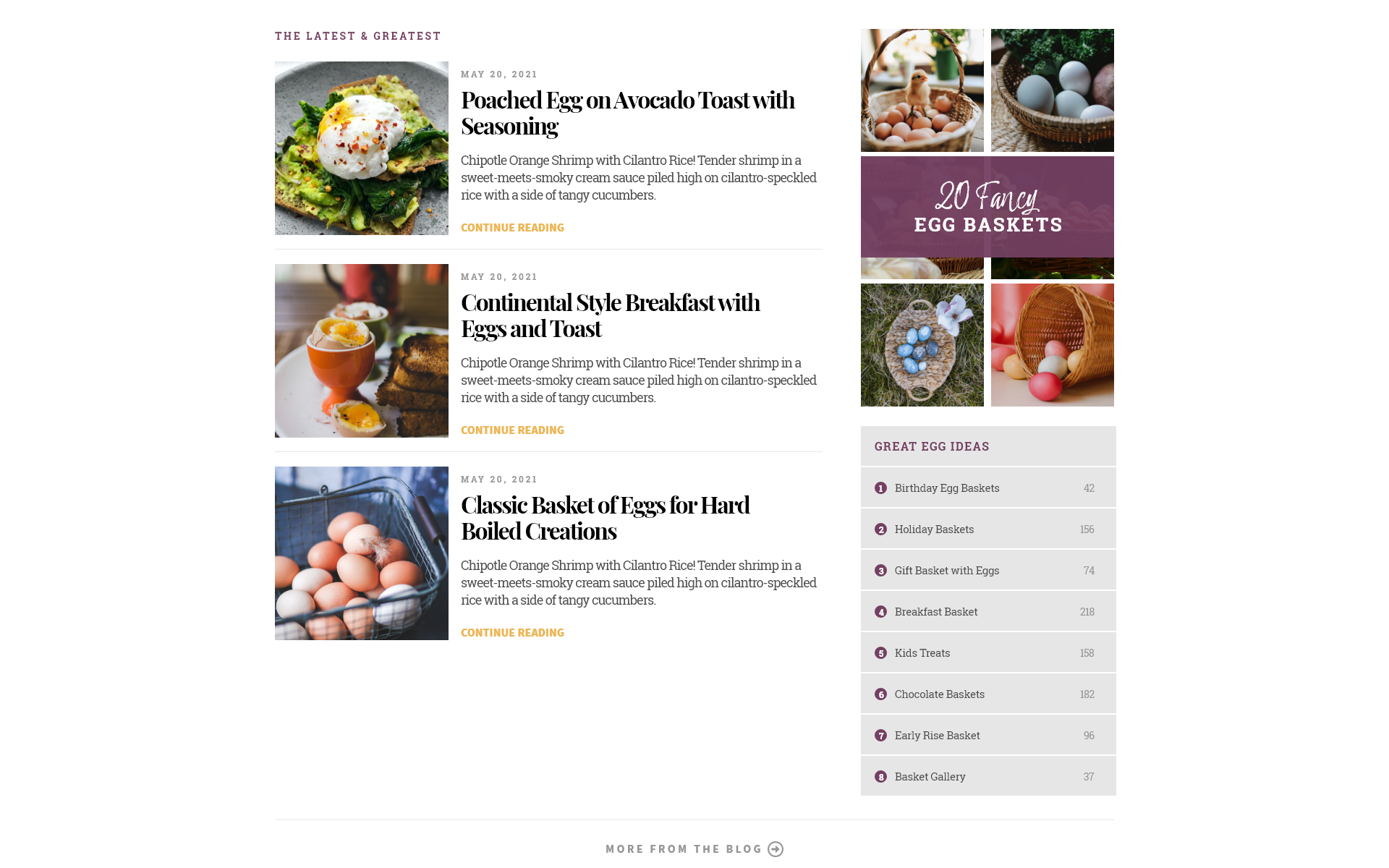
Smaller Images

Newsletter

Footer

Coding Phase
The design phase was very useful to identify different features used on the website like the colors and fonts. The design phase also analyzed the website structure and component construction. This process was helpful to begin considering how to code the different components, where there could be reuse of components, and how various components would fit together into a layout. The design process was invaluable to do some of this “set-up” work during this phase rather than during the coding phase. Doing it this way, I was able to identify and export design features to have ready-at-hand at the outset of the coding phase. What this meant in practical terms was that I could link and import my fonts that I chose during the design phase.
@import url('https://fonts.googleapis.com/css2?family=Source+Sans+Pro:wght@400;700;900&display=swap');
@import url('https://fonts.googleapis.com/css2?family=Allura&display=swap');
@import url('https://fonts.googleapis.com/css2?family=Playfair+Display:wght@400;700&display=swap');

/* VARIABLE FONT */
@font-face {
  font-family: 'Roboto Slab';
  font-weight: 100 900;
  font-style: normal;
  font-stretch: normal;
  src: url('fonts/RobotoSlab-VariableFont_wght.ttf') format('truetype');
  font-display: swap;
}

/* NORMAL FONT */
@font-face {
  font-family: 'Sacramento Regular';
  src: url('fonts/Sacramento-Regular.ttf') format('truetype');
  font-weight: normal;
  font-style: normal;
}
Once the fonts were imported, I could then make use of CSS variables to assign them named variables. This was also done for the colors from the design.
:root {
  /* COLORS */
  --brand-primary: #734061;
  --brand-primary-rgb: 115, 64, 97;
  --brand-secondary: #edb554;

  --darkest: #171a16;
  --dark: #4d4d4d;

  --light: #979797;
  --light-alt: #d1d1d1;
  --lightest: #e6e6e6;

  --black: #000000;
  --white: #ffffff;
  --white-rgb: 255, 255, 255;

  /* FONTS */
  --roboto-slab: 'Roboto Slab', Helvetica, Arial, sans-serif;
  --sacramento-regular: 'Sacramento Regular', cursive;
  --allura: 'Allura', cursive;
  --sans-source-pro: 'Source Sans Pro', Helvetica, Arial, sans-serif;
  --playfair-display: 'Playfair Display', 'Times New Roman', Times, serif;
}
Another approach I could have taken was to code baseline versions of the molecules and organisms identified in the design phase and then insert them into the layout structure as needed. For websites that are coded with a more purely component design pattern, this would definitely make sense. Since the goal of this challenge was to build a single webpage as an HTML document, I decided to focus more on coding each section separately - based on the page construction sections described above. By doing this, I could also focus more on how the layout semantics section by section.
This process ranged from the simple to the complex. For example, the header section consisted of a branding logo and a group of navigational links and a search icon, all contained within a <header> semantic element. To mimic a component-based coding approach, the logo and navigation were coded in separate HTML files. The code for each component was then copied into a Header.html file. The Header.html file focused mostly on layout and arrangement of the component pieces to match the design for this section.
<div class="header-container">
  <header class="header">
    <h1 class="logo">
      <a href="/">basket <span>of</span> eggs</a>
    </h1>
    <nav class="navigation">
      <ul>
        <li><a href="/">Home</a></li>
        <li><a href="/">About</a></li>
        <li><a href="/">Egg Combos</a></li>
        <li><a href="/">Contact</a></li>
      </ul>
      <i class="fas fa-search"></i>
    </nav>
  </header>
</div>
The CSS code for the header section, and subsequent sections, was coded section by section. The code below shows some of the CSS for the logo located within the <header> element. The logo makes use of a few of the CSS variables added earlier in the coding phase.
/* HEADER - LOGO */
.logo {
  font-family: var(--roboto-slab);
  font-weight: 300;
  font-size: 2rem;
  margin: 0 1rem;
}

.logo a {
  text-decoration: none;
  color: color: var(--brand-primary);
}
More Complexity
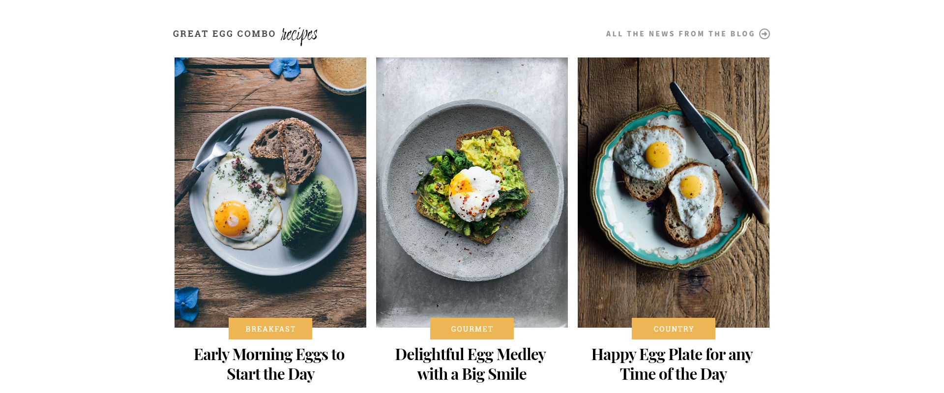
As the coding phase continued, the structure of the website added more complexity. For example, in the Hero section, there was a header element that included a hero title and link to a “more news” page. Below the header area were three visual elements. These were called cards and each with constructed from an image and two formatted textual elements. This card was identified in the design phase as one of the molecules in the design.
My approach to coding this section was to code each component individually in separate files. This was done as to keep the focus of the code on the component itself, not the layout or relationships between components within the layout. Focusing the coding first at the component level also helped identify clear responsibilities for each part of the code. For example, the hero title component was responsible for the font, color, and sizing of the hero title elements, as shown below.
<h4 class="hero-title">Great Egg Combo <span>recipes</span></h4>
/* HERO - HEADER - TITLE */
.hero-title {
  font-family: var(--roboto-slab);
  font-size: 0.8rem;
  text-transform: uppercase;
  letter-spacing: 0.2rem;
  color: var(--dark);
}

.hero-title span {
  font-family: var(--allura);
  font-size: 2rem;
  text-transform: none;
  letter-spacing: normal;
}
The hero title, however, was not responsible for its layout or position. That responsibility fell to the header sectioning element. The header contained both the hero title and the link. The header element’s main responsibility was to manage the layout of the child elements - hero title and the link - not for the visual appearance of child elements. To this end, the header section defined a width, margin, and used flexbox to position the child elements.
/* HERO - HEADER */
.hero-header {
  display: flex;
  justify-content: space-between;
  align-items: center;
  width: 1280px;
  margin: 0 auto;
}
<header class="hero-header">
  <h4 class="hero-title">Great Egg Combo <span>recipes</span></h4>
  <nav class="hero-navigation">
    <p>All the News from the Blog</p>
    <i class="far fa-arrow-alt-circle-right"></i>
  </nav>
</header>
For the cards, the approach was the same. It began with the Card component, which was coded with a focus on the visual design of the component and not it’s layout on the page. The card itself does have a specific width and height, and this is something I’d want to address moving forward - to have a container handle the width and height, and have the card flow into that container. For now, the card with a fixed width and height works for the challenge.
<div class="hero-card">
  <div class="hero-card-image">
    <img src="images/hero-1.jpg" alt="Plate on table with eggs" />
  </div>
  <p class="hero-card-highlight">Breakfast</p>
  <p class="hero-card-title">Early Morning Eggs to Start the Day</p>
</div>
/* HERO CARD */
.hero-card {
  display: flex;
  flex-direction: column;
  align-items: center;
  position: relative;
}

.hero-card-image {
  height: 550px;
  width: 415px;
  overflow: hidden;
}

.hero-card-image img {
  width: 100%;
  height: auto;
  transition: transform 0.2s;
}
A single card is self-contained and can be placed within a layout container, the div with a class of cards in this case. The div handles the layout for the cards, again applying a flexbox layout of space-between to fill the container evenly from edge to edge.
<div class="cards">
  <div class="hero-card">
    <div class="hero-card-image">
      <img src="images/hero-1.jpg" alt="Plate on table with eggs" />
    </div>
    <p class="hero-card-highlight">Breakfast</p>
    <p class="hero-card-title">Early Morning Eggs to Start the Day</p>
  </div>
  <div class="hero-card">
    <div class="hero-card-image">
      <img src="images/hero-2.jpg" alt="Plate on table with eggs" />
    </div>
    <p class="hero-card-highlight">Gourmet</p>
    <p class="hero-card-title">Delightful Egg Medley with a Big Smile</p>
  </div>
  <div class="hero-card">
    <div class="hero-card-image">
      <img src="images/hero-3.jpg" alt="Plate on table with eggs" />
    </div>
    <p class="hero-card-highlight">Country</p>
    <p class="hero-card-title">Happy Egg Plate for any Time of the Day</p>
  </div>
</div>
.cards {
  display: flex;
  justify-content: space-between;
  width: 1280px;
  margin: 0 auto;
}
Finally, both the <header class="hero-header"> and the <div class="cards"> sectioning elements are placed within a <section class="hero"> element. The section container then handles the layout of the two other sectioning elements, which in this case follows normal flow of two block elements each taking up separate rows on the page by default.
Following this approach for the remainder of the layout sections, components were built separately and fed into the layout containers, which were then combined together to build the full content of each section. Then the sections were put together to construct the final webpage.
The results of the challenge were satisfying. The final design and code are visible on a fully-functional webpage for the challenge. The challenge also has a GitHub repository for the development process.
A note on the images used for the challenge. I downloaded all the images from Pexels, which is a free stock photo website. There are a lot of great photos and are often free to use without need for attribution. It’s recommended to give attribution, however, in support of the content creators. The images I used were from the creators, Daria Shevtsova, Klaus Nielsen, Daniela Constantini , Julian Schwarzenbach, Anastasia Shuraeva, Rodolfo Clix, Kaboompics .com, Roman Odintsov, Krisztina Papp, Nida, and Life Of Pix.
This challenge was successful in implementing some concepts and technologies that I’ve been learning along the way - web fonts and icons, layout with positioning and flexbox, and an atomic design approach. It does not do a good job with responsive design or layout, but those features will appear in future challenges.
