Challenge Three - E-Commerce Website
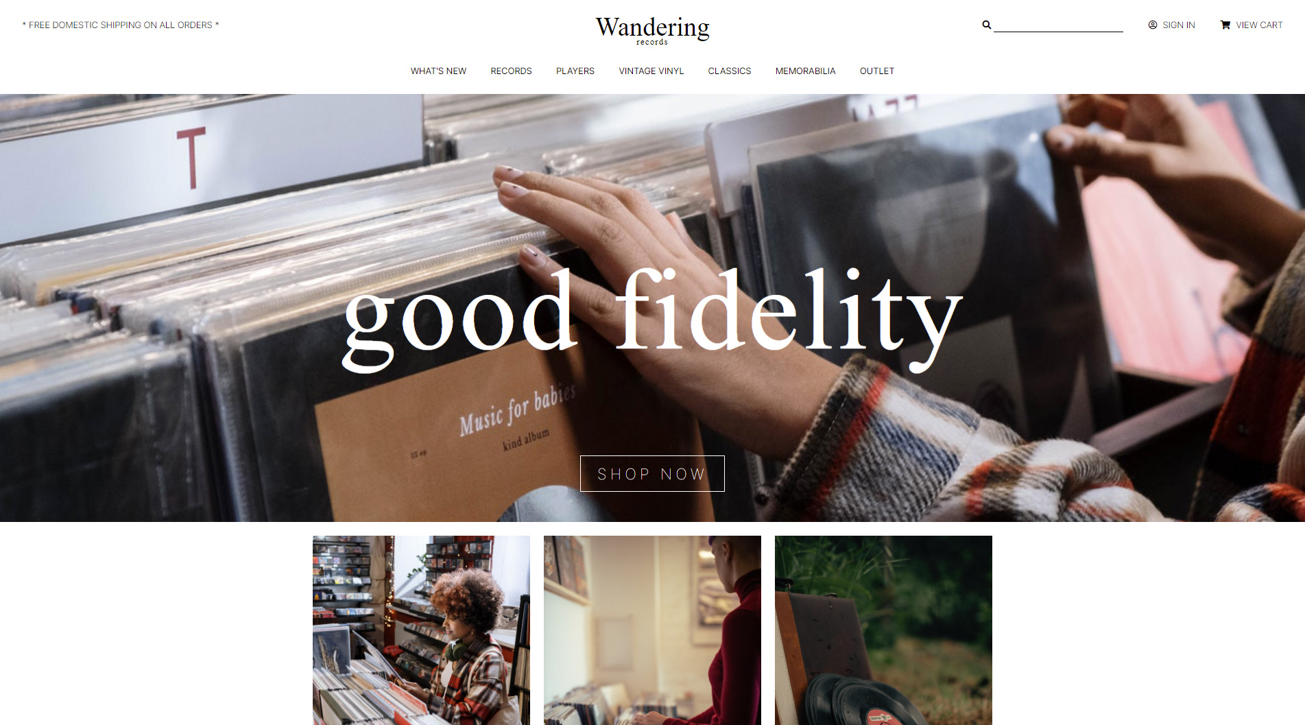
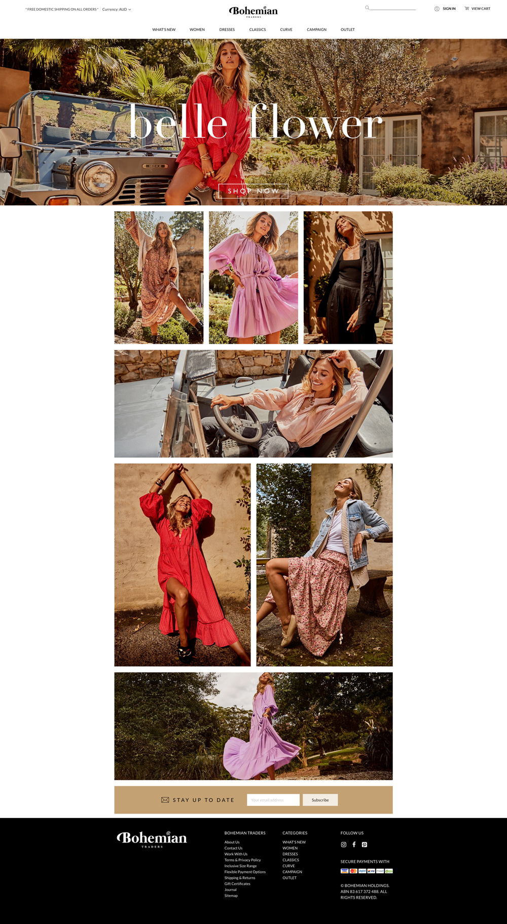
The third challenge in the UX/HTML/CSS Design and Code Challenge series is an e-commerce website. The rationale for this particular challenge was to find a site that could easily lend itself to use of CSS Grid layout. The inspiration for this challenge comes from the website Bohemian Traders, which is an online shop to purchase clothing based in Australia.
The challenge, like previous challenges, is to recreate the design of the website homepage (live version of the final website). The focus of this challenge is slightly different than previous challenges in that the focus for this challenge is less on design process and more on application of CSS Grid for mobile and desktop.
Putting CSS Grid to Work
CSS Grid is specification for layout in CSS that makes two dimensional grid systems. CSS Grid has an extensive set of features to create columns, rows, designate parts of the grid for specific purposes, and control alignment in all directions. Because it has an extensive set of features, CSS Grid takes some practice to get comfortable with the features. Thankfully, there are many great resources available to help learn CSS Grid including many paid and free tutorials, several books, and many good websites. Here’s a sample of some of the websites I consulted when learning the fundamentals.
Learning Resources
Visual Examples of Layouts
Finding a Good Design
The inspirational website for this challenge was a perfect candidate for the use of CSS Grid. Two key features of this website made it a good candidate. First, the design employs a full bleed header, hero section, and footer. And second, the main content area is a series of images contained within a fixed column and laid out in a grid pattern. Traditionally, a layout like this would be somewhat tricky to implement without using a lot of div containers and extensive CSS, especially considering the need to create both a design for mobile and larger screen sizes.
Working through the Design
One of the initial steps I take with these challenges is to explore and take apart the design using a UX design tool, Adobe XD in my case. This is an important part of the process to help identify typography, color palette, icon usage, layout patterns, spacing, and components that will be translated in HTML and CSS. I also use the design phase to build a design based on the inspirational website, but with different branding, images, and content. Doing this allows me to retain the important layout and design aspects of the website - which I want to recreate - while using different content so as to not just copy the inspirational website’s content.
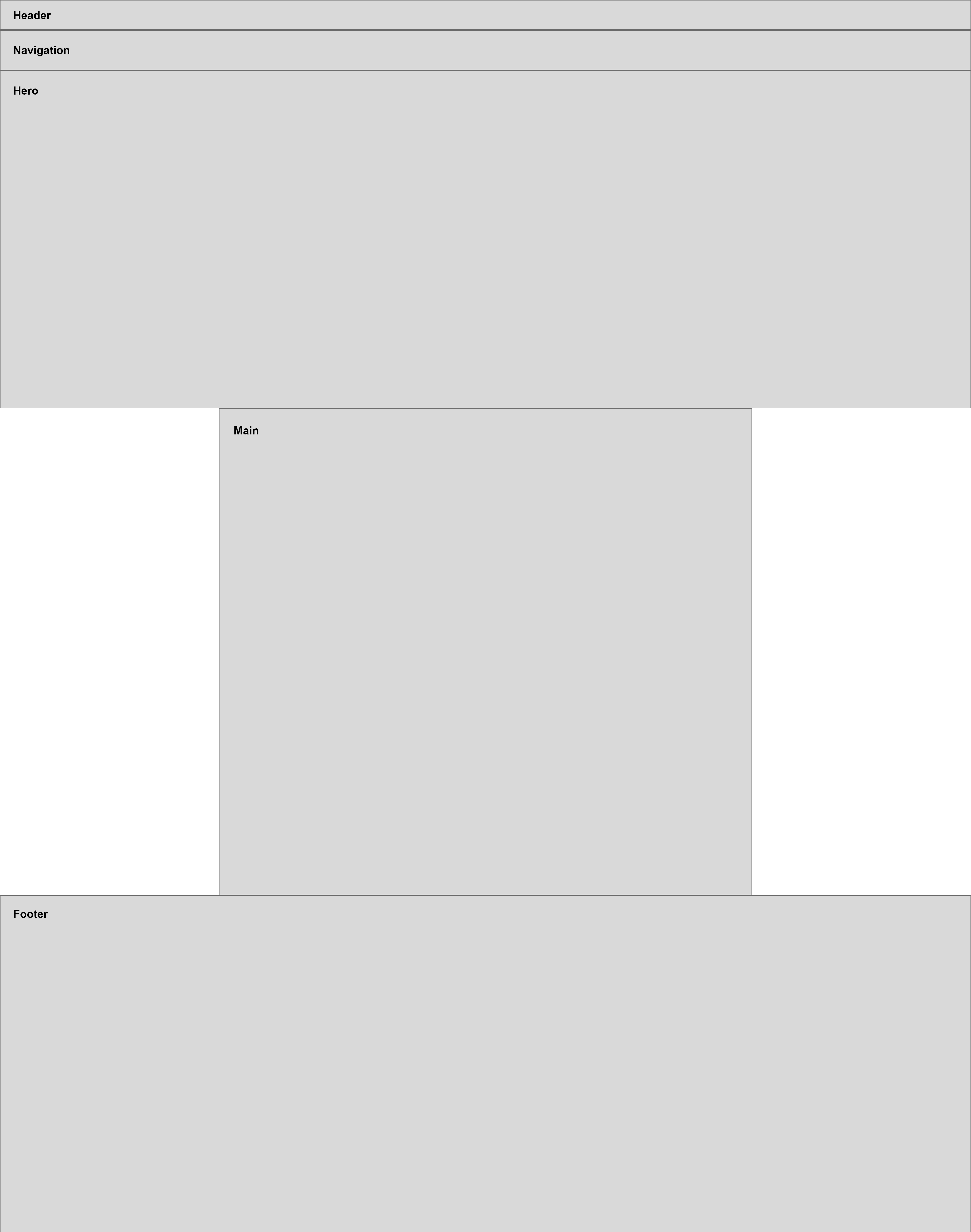
The first step in the design process to prepare it for working with CSS Grid was to identify the different and distinct sections of the website. For this challenge, there are only five distinct sections that jumped out in the analysis - the header, navigation, hero, main content, and footer. Each of these sections can also be considered as candidates for rows within the grid layout.
The result of this process concluded with the production of two finished prototype screens - mobile and desktop - which I would use as the basis for building each with HTML and CSS in the Development phase.
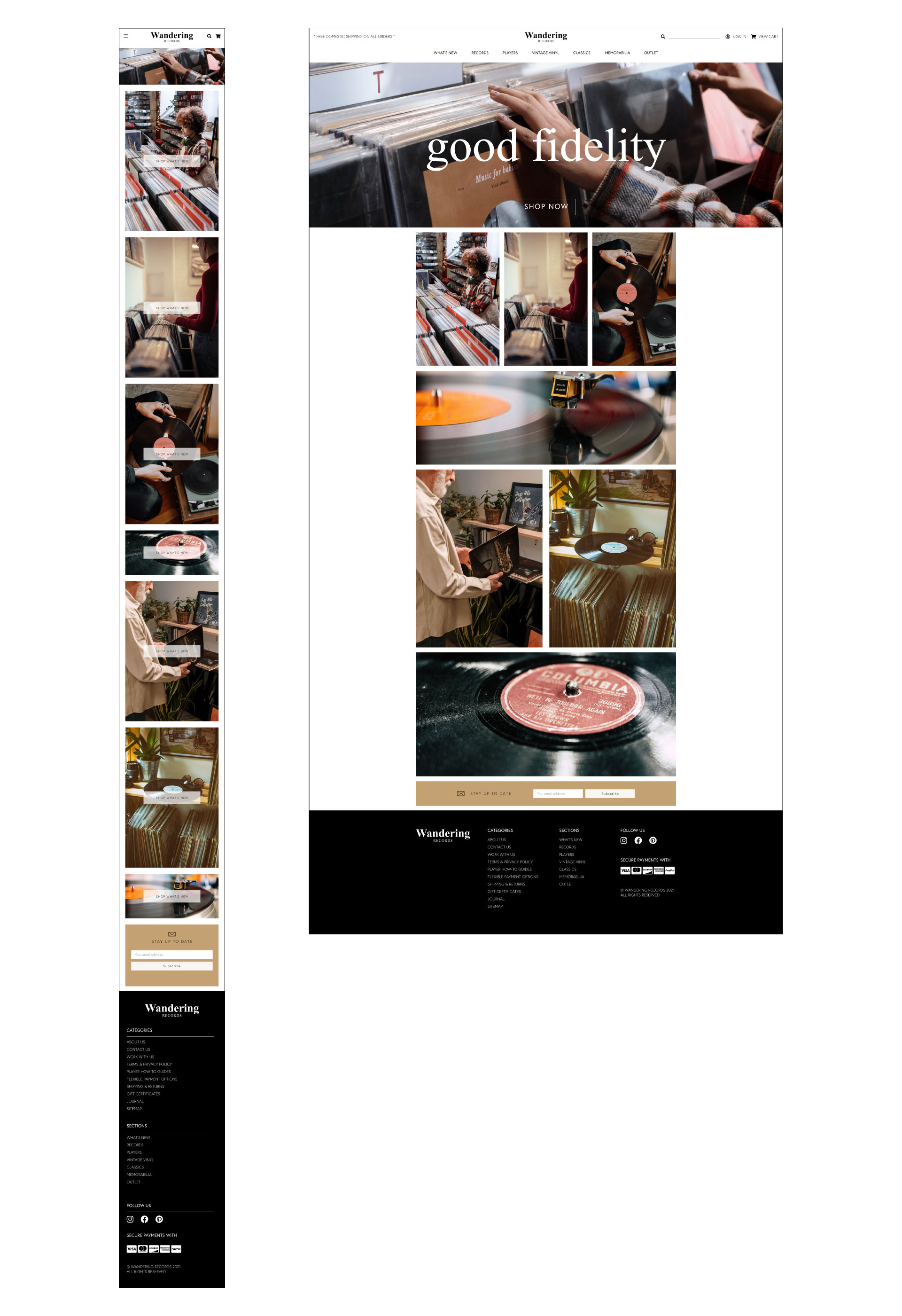
Part of the value of the design process is in planning how to structure the layout and grids that will eventually be created with the HTML and CSS. This design has two major grids - a site grid that would layout the entire page contents and a nested grid for the main content, which mostly included a mosaic of images.
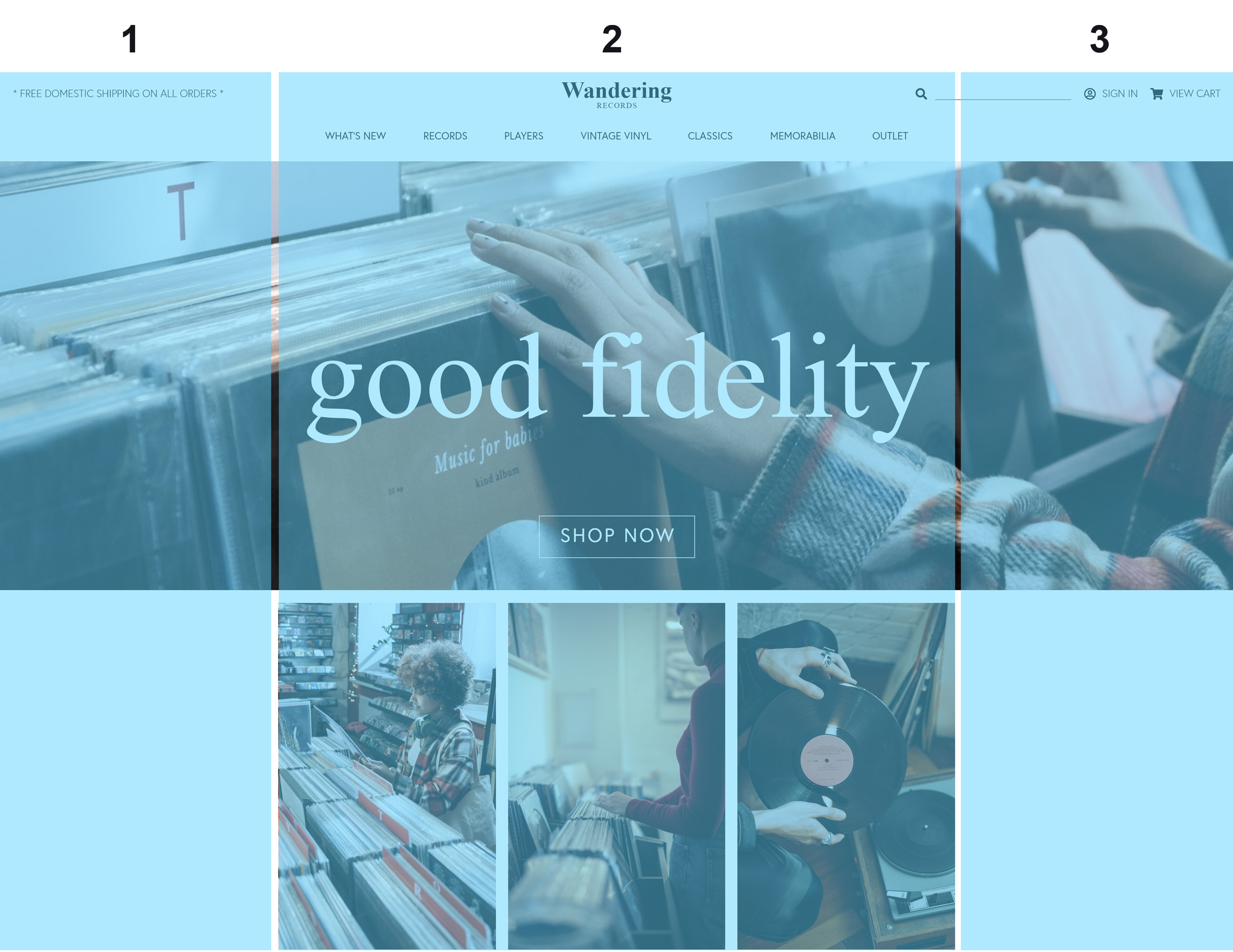
The site grid is composed of three columns. The central column will encompass the main content of the site, otherwise the other sections - header, hero, and footer will be full bleed sections. The central column is more complex in its layout.
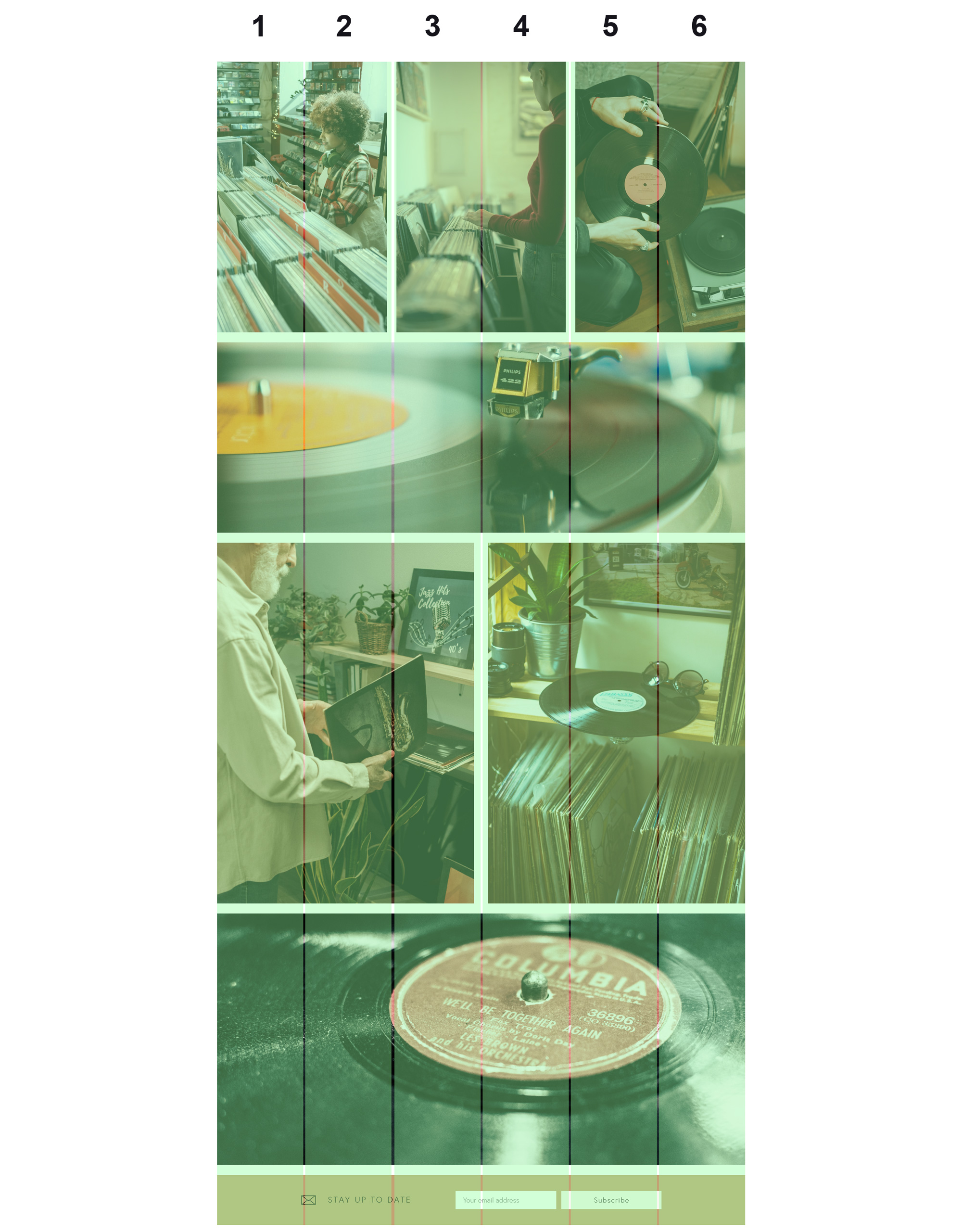
The main grid is six columns. This number was chosen based on the need to divide the layout into sections for rows that include 3 photos, 2 photos, and a single photo. Using a six column grid is ideals since it can be divided and combined in multiple ways.
Development with Grids
Mobile Version
A key component of this challenge was the attention to developing mobile and desktop versions of the site. This presented some development challenges since the grid for the mobile version was different than what is used for the desktop. For the mobile version, the grid used was a straight-forward one-column layout. There are a few ways to handle the transition from a one column to a three column layout. A great article about this is Josh Comeau’s Full-Bleed Layout Using CSS Grid. This article describes creating a three column grid that has a fixed 2nd column that uses the min() function to select the smaller between two width values.
.container {
  display: grid;
  grid-template-columns: 1fr min(124ch, calc(100% - 48px)) 1fr;
  grid-template-rows: 60px 0 auto;
  gap: 16px 24px;
}
The code above shows how the grid columns are laid out with the grid-template-columns property. This property makes use of a new unit of measure specifically for CSS Grid - the fr or fractional unit. An fr unit will take up a fraction of the space available for a grid after other space has been allocated. For example, for the grid defined as grid-template-columns: 1fr 800px 1f, the grid is composed of three columns. The 2nd column is 800px wide. Whatever space is left after the 800px has been allocated will be divided equally between the first and third columns.
In the case of the mobile view, the 2nd column as defined in the code snippet above will take up the smaller of the two value options 124ch or 100%. On smaller screens, there isn’t enough room for display of a 124ch wide column, so it will use the calc(100% - 48px) option. Because the fr unit takes up the remainder of the space left after specified column widths have been allocated, they will both take up minimal space since there will be little space left to divide.
However, the columns will both still exist and need to be respected in the CSS for grid items. This is done by making using of the grid-column property. For example, the header section will span all three columns in the desktop layout. One the mobile layout, it will take up less space, but still needs to be defined as to take up a three column layout. This is accomplished with the following code.
header {
  grid-column: 1 / 4;
  padding: 0 32px;
}
The important section is the grid-column: 1 / 4; property declaration, which says that the header should span the grid columns starting from the left side of the first column and ending at the right side of the third column. Another way to think about the numbers used in the grid-column property is to base their application on the underlying structure of the grid columns, which functionally works as if it was written like this: grid-template-columns: [1] 1fr [2] min(124ch, calc(100% - 48px)) [3] 1fr [4]. The numbers here, which aren’t needed in the property declaration but do correspond to the line names of the grid. Therefore, the header will span the columns from line names 1 to 4, or the entire width of the grid-columns.
Main Section Images for the Desktop Layout
One nice feature of CSS Grid is the ability to create nested grids. This is useful for creating two completely different layouts for the main section of the website that includes several images. In the mobile layout, the images for the main section are laid out as one column. However, in the desktop layout, the images are placed in a more complex mosaic layout with rows that have either 1, 2, or 3 images next to each other. Thankfully, CSS Grid makes this type of layout fairly easy to create.
Based on work done in the design phase, a six column grid is needed for this part of the website. Because it’s easy to span multiple sections, this grid will offer good versatility.
main {
  grid-template-columns: 1fr 1fr 1fr 1fr 1fr 1fr;
  grid-template-rows: 470px 380px;
  gap: 20px;
}
For the main section grid, there are six columns, each consisting of 1fr unit. Based on this definition, grid will be divided into six equal sections no matter the actual width of the middle area, the 1fr units will adjust as the container size grows or shrinks. All that is left is to place the individual images into the grid as desired. This is done by defining classes that correspond to how many columns should be spanned at once. The options are a third span, or 2 of 6 columns, a half span, or 3 of 6 columns, or a wide span, which is 6 of 6 columns for the full width. These different options can be defined as the following.
.third-span {
  grid-column: span 2;
}

.half-span {
  grid-column: span 3;
}

.wide-span {
  grid-column: 1 / 7;
}
This CSS also shows the different ways to declare how grid items should be placed in the grid. The grid-column: span 2 is equivalent to writing grid-column: 1 / 3.
The grid items will be placed into the grid in the sequence they are defined in the HTML code, starting from top to bottom. Once the space for all columns in a grid row are taken up, the grid will move to the next row to continue dividing up the grid space.
Overlaying Content in the Same Grid Cell
Another great feature of CSS Grid is the ability to place content within the same grid cell and create overlapping content. An example of this from the design is the hero area, which includes a full bleed image with text and a button that overlays the image. Traditionally, this could be accomplished with relative and absolute positioning, which also required use of the top, right, bottom, and left properties to place the absolutely positioned element in the correct location.
With CSS Grid, it’s possible simply to declare that elements should occupy the same grid cell. CSS Grid also makes available several properties for alignment, which solves the problem of positioning. For the hero image, the following HTML is used.
<div class="container">
  <header>...</header>
  <nav>...</nav>
  <a class="hero-image" href="#">
    <img src="images/hero-wide.jpg" alt="Records" />
  </a>
  <a class="hero-text" href="#">
    <h2>good fidelity</h2>
  </a>
  <a class="hero-button">Shop Now</a>
</div>
To get this to work as desired, it’s first important to make use of how CSS Grid lays out rows. Grid items, which are defined as immediate children to the grid container, will be laid out into the grid in sequence as defined the HTML code one grid cell per element unless told to behave differently. One way to control the layout is to specify the grid row for an element using the grid-row property. For the hero elements, as defined by the HTML code above, they are laid out in the same grid cell using the following CSS code.
.hero-image {
  grid-column: 1 / 4;
  grid-row: 3 / 4;
}

.hero-text {
  grid-column: 2;
  grid-row: 3 / 4;
  place-self: center;
}

.hero-button {
  grid-column: 2;
  grid-row: 3 / 4;
  place-self: end center;
}
The important part of the code is the grid-row property. For each element that make up the hero section of the layout, they use the same property and value of grid-row: 3 / 4, which tells the layout to put each of these elements into the row between the 3rd and 4th line names of the grid. The arrangement of the elements within the grid cell is handled with the place-self property, which defines how a grid-item should position itself within a grid cell. For the .hero-text element, there is a single value of center, which means that the item should be positioned in the center for both the vertical and horizontal directions. For the .hero-button element, however, the position should be at the end of the grid cell for the vertical (or align-self) direction and at the center of the grid cell for the horizontal (or justify-self) direction. The result is that all elements are placed on top of each other, achieving a complex layout that also preserves accessibility since it does not require multiple levels of element nesting.
Conclusion
This challenge was great to get comfortable with CSS Grid layout. All areas of the layout were handled with CSS Grid, including areas that could conceivable be handled just as easily with Flexbox - the navigation section, for example. A great feature of CSS Grid is it’s versatility for handling both simple and complex layout needs. A great benefit of CSS Grid is that it allows developers to write semantic HTML code and leave the visual layout to the CSS code separately. CSS Grid also lends itself to flexibility when building a responsive website. Taking advantage of flow of grid items within a grid layout, the transition from a complex grid for desktop to a simpler grid for mobile can be handled without too much difficulty.
In this challenge, just like in the 2nd challenge, I made use of stock images from Pexels. The creators whose work I used include cottonbro, Ekrulila, Matthias Groeneveld, Alina Vilchenko, and Brett Sayles. The images from Pexels are very high quality and really give a polish to the final website.
