Challenge Four - Travel Blog
The fourth challenge in the UX/HTML/CSS Design and Code Challenge series is a travel blog website. This challenge continues to explore CSS Grid layout and adds support for responsive layouts for mobile, tablet, and desktop versions. The inspiration for this challenge comes from the website Traveling Mitch, which documents the authors travel experiences.
The challenge, like challenges one, two, and three is to recreate the design of the website homepage (live version of the final website for challenge four). The focus of this challenge is on responsive design. This challenge also builds upon previous challenge concepts, particularly CSS Grid.

Design and Development for Different User Experiences
This challenge is focused on optimizing the webpage for users who access the page with either a desktop, tablet, or mobile screen. To create a pleasant experience for each type of screen, I made use of Responsive Design techniques. This primarily means that I used several media queries to detect browser widths and adjust the layout accordingly. Of course, to accomplish this, some research is necessary. I found some good documentation on media queries to help master the syntax I would be using.
Once I’d become comfortable with the basics of writing media queries, it was time to analyze the inspiration website and work through a design.
A Design with Room to Grow
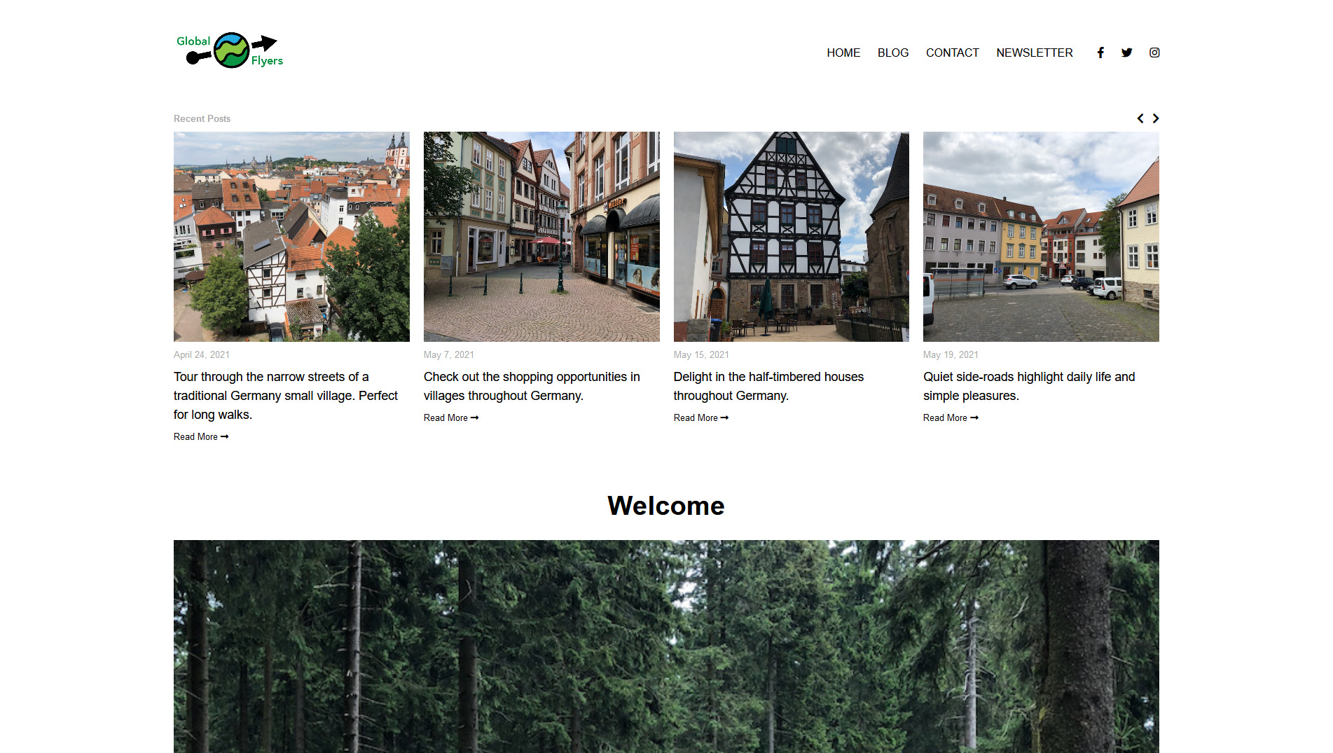
The Inspirational Website presents a few opportunities to create an interesting design, apply responsive design, and even make use of technologies like CSS Grid. The website includes a header with a log and links, a row of four recent post entries, an hero image, a call to action section, another section of several blog post entries for multiple categories, and finally a footer section.

The website does have some responsive design features including a tablet and mobile display that condenses the content and offers a mobile-friendly header and navigation. One aspect of the design that offers possibilities for improvement is the layout of the blog post entries on the mobile display. In the desktop layout, the blog post entries display as a single row of three or four individual elements composed of a clickable image, a time, and a title. When the layout changes to a mobile layout, the three or four entries are squeezed into the space available, but still in a row. The result is a very small image next to larger text. This is one area that can be improved by designing a column list of blog entries instead of a row.
Likewise, the header section in the mobile layout of the website can be reorganized to include a larger and center aligned logo image. At the same time, the menu hamburger and search icon can be repositioned on opposite sides of the centered logo.
The text sizing and page element spacing can also be improved for the different responsive layouts to make the text more readable and the site easier to navigate generally from one section to the next.
Designs for Three Screens
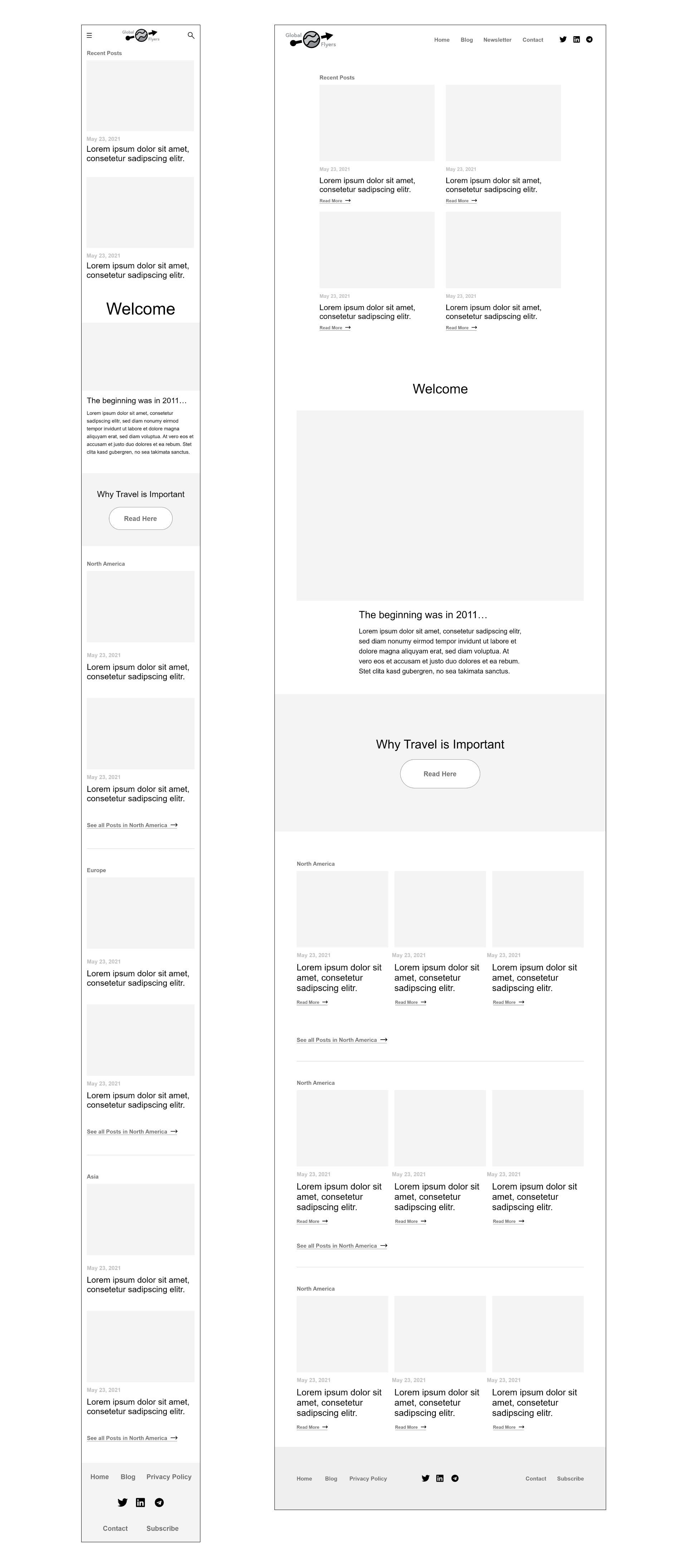
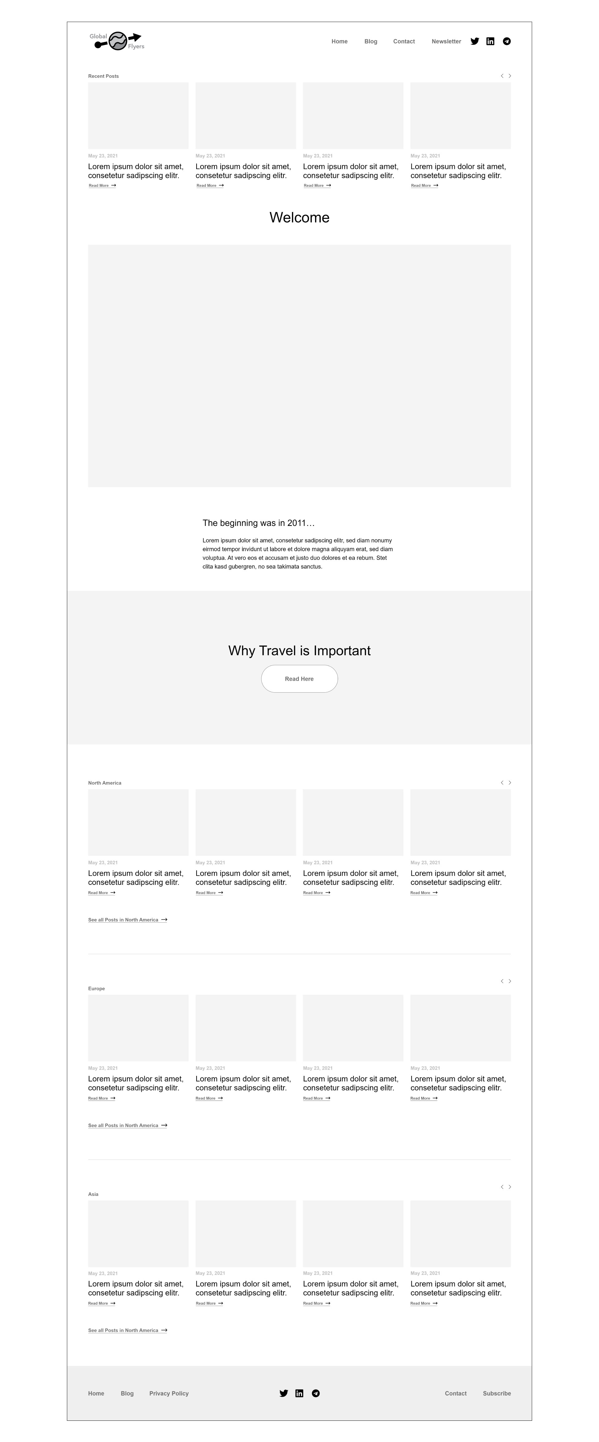
In analysis of the design, and to find solutions to the issues mentioned above, the design phase resulted in the creation of three different layouts - a mobile, tablet, and desktop version.
Mobile and Tablet Layout
The thing that jumps out for the mobile and tablet layouts is the adoption of a simplified design - a single column for the mobile design and a 2x2 grid for the tablet design. The header section of the mobile layout is also redesigned. Otherwise, the design follows closely to the inspirational website.

Desktop Layout
The desktop layout is very faithful to the inspirational website, with few changes from the original design layout or elements.

Development Phase
The development phase involved a few important stages. First, there was some experiment along with trial and error to get the development moving forward. The result from this was mixed at first and required some rethinking. Two important considerations made a big difference in the success of the development.
Mobile First is the Way to Go
Although there are many articles supporting mobile-first approaches and the concept has been around for a long time, it’s value should not be understated.
The idea behind a mobile-first approach is that a design should be developed first for mobile devices and users. This approach guarantees that the essential aspects of the website are included in the mobile version and extra enhancements, not essential to the core purpose of the website, are added as the website adapts to larger screen sizes. Another reason this is important is that a growing proportion of internet users are accessing websites with a mobile device.
Mobile first also is good from a developer perspective in that a mobile version of the website can be created first and using responsive design with media queries, the design can be modified where needed for larger screens. This can result in less duplication of code and a better development experience.
Take Advantage of New CSS Techniques
A really good article on responsive design used in conjunction with newer CSS features is from CSS-Tricks - Responsive Designs and CSS Custom Properties: Defining Variables and Breakpoints. This article demonstrates how to use a feature like CSS variables to define properties that will be reused across a responsive design - such as font-size and padding for text and elements. The spacing and text size will adjust from the mobile to desktop layouts, requiring these properties to be redefined for each media query. The approach to handle this better is using CSS variables and defining different values for each media query and then applying the CSS variable for the class or element, which will use the value defined by the media query.
/* MOBILE */
:root {
  --xl-text: 3rem;
  --h1-heading: 2rem;
  --text-vertical-spacer: 9px 0 1px;
}

/* TABLET */
@media (min-width: 700px) {
  :root {
    --xl-text: 2.6rem;
    --h1-heading: 1.8rem;
    --text-vertical-spacer: 6px 0 3px;
  }
}

/* DESKTOP */
@media (min-width: 1280px) {
  :root {
    --xl-text: 2.4rem;
    --h1-heading: 1.6rem;
    --text-vertical-spacer: 5px 0 5px;
  }
}

/* STYLE APPLICATION */
.xl-text {
  font-size: var(--xl-text);
}

.main-heading {
  font-size: var(--h1-heading);
}

.text-vertical-spacer {
  margin: var(--text-vertical-spacer);
}
This approach allows for easier management for development since the media queries don’t require the style to be added and redefined each time. The class simply picks up the updated property value from the matching media query.
Another great approach is to develop the CSS for the mobile version of the website first and then to apply new CSS only to the properties that change for the media queries in the tablet and desktop layout media queries. For example, the CSS for the mobile layout defined a display value of grid for the .container element. However, since the tablet and desktop layouts also make use of the grid display, it’s not necessary to include this in the property definitions for the class in other media queries since the value doesn’t change. The CSS defined for the mobile layout will continue to be applied even when the next media query is applied.
/* SMALL SCREEN */
.container {
  display: grid;
  grid-template-columns: 20px 1fr 20px;
  grid-auto-rows: auto;
  gap: 10px;
}

/* TABLET */
@media (min-width: 700px) {
  .container {
    grid-template-columns: 5% repeat(2, 1fr) 5%;
  }
}

@media (min-width: 1280px) {
  .container {
    grid-template-columns: 12.5% repeat(4, 1fr) 12.5%;
  }
}
As shown in the example above, the only property changing between layouts is the grid-template-columns property, otherwise all the other properties should be applied as they were defined for the mobile layout.
CSS Grid for the Layout
Designing layouts for a mobile, tablet, and desktop view can make use of CSS Grid to define grids with different columns and rows which change for different layouts. For example, in the mobile layout, the main grid is a 3 column grid - with most of the content in the middle column and the first and third columns acting as padding for the page content. For the tablet layout, the grid changes to a 4 column grid - creating central columns and rows for a 2x2 layout for the blog posts. Finally, the desktop layout introduces a 6 column grid that has a central area for a 4x1 layout for the blog posts. Media queries make applying different grid layouts fairly easy - requiring updated grid-column property definitions for page content, but otherwise nothing too tricky.
/* SMALL SCREEN */
.recent-posts {
  grid-column: 2 / 3;
}

/* TABLET */
@media (min-width: 700px) {
  .recent-posts {
    grid-column: 2 / 4;
  }
}

@media (min-width: 1280px) {
  .recent-posts {
    grid-column: 2 / 6;
  }
}
Conclusion
This challenge was good for focusing on design and development for different layouts, which is an essential requirement for web development today. The mobile-first approach definitely made the development process easier and is great to get a grasp on how the design builds up from this starting point. Creating layouts that are easy to read and interact with on a mobile screen can easily be taken for granted. It’s very helpful to test out designs and development on multiple devices to see how they look in action. Deciding to change the blog post entries design from a three-column layout found in the inspirational website to a single column layout in my final version was definitely an improvement.
